VISION BOARD
Agent Leader
Rebranding Creative
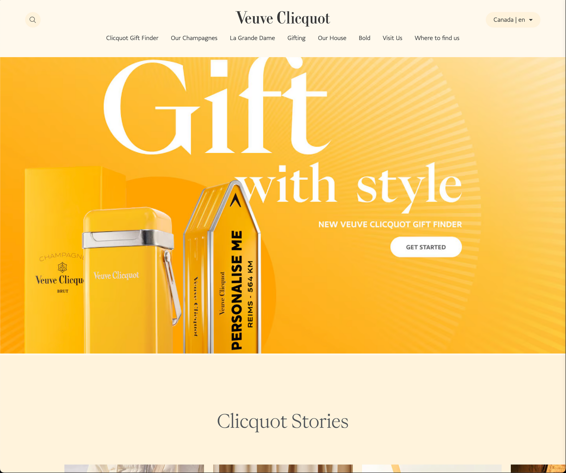
The goal of this rebrand is to elevate Agent Leader to reflect luxury, confidence, and modern professionalism while maintaining the approachability that defines Lisa Grace's coaching style. Drawing inspiration from brands like Veuve Clicquot, Selfridges, and others, we will harness bold yellows, clean layouts, and refined typography to craft a sophisticated yet dynamic identity.
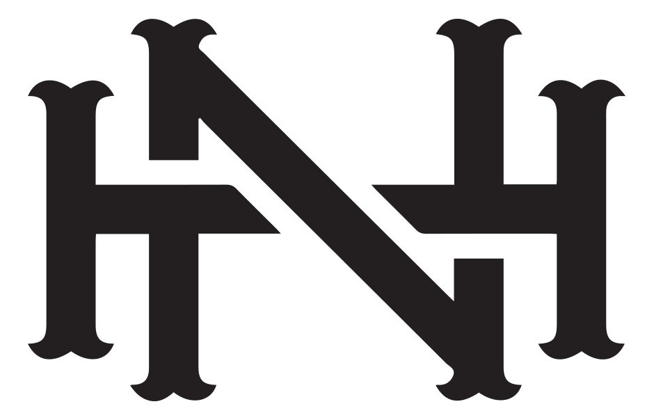
Agent Leader - Logo 1
- Icon Design: The icon forms a bold "A" shape with a pathway leading inward, symbolizing growth, guidance, and leadership.
- Message: The pathway suggests direction, which aligns well with the concept of coaching. The use of symmetry conveys stability and professionalism.
Strengths: Clean and modern aesthetic. Easily recognizable and scalable.
Agent Leader - Logo 2
- Icon Design: The icon uses multiple concentric arch shapes that lead inward, creating a sense of depth and perspective.
- Message: The layered arches imply inclusivity, protection, and a journey toward a focal point, symbolizing personal or professional growth.
Strengths: The arches give it a dynamic and evolving feel.
Agent Leader - Logo 3
- Icon Design: The icon is a simplified "A" formed by bold lines and a pathway leading inward. It combines elements of minimalism with strong geometry.
- Message: Like the first design, the pathway highlights guidance and forward movement. However, this design feels slightly more refined and formal due to the sharpness of the edges.
Strengths: The minimalist approach is timeless. It has a professional tone, which works well for a coaching service.
Final Recommendations
If you're targeting a modern, professional audience with a focus on leadership and growth, Logo 3 might be the best option.
If you want to emphasize inclusivity, guidance, and a journey-like experience, Logo 2 could resonate well.
Logo 1 is a versatile choice, striking a balance between modern professionalism and approachability.
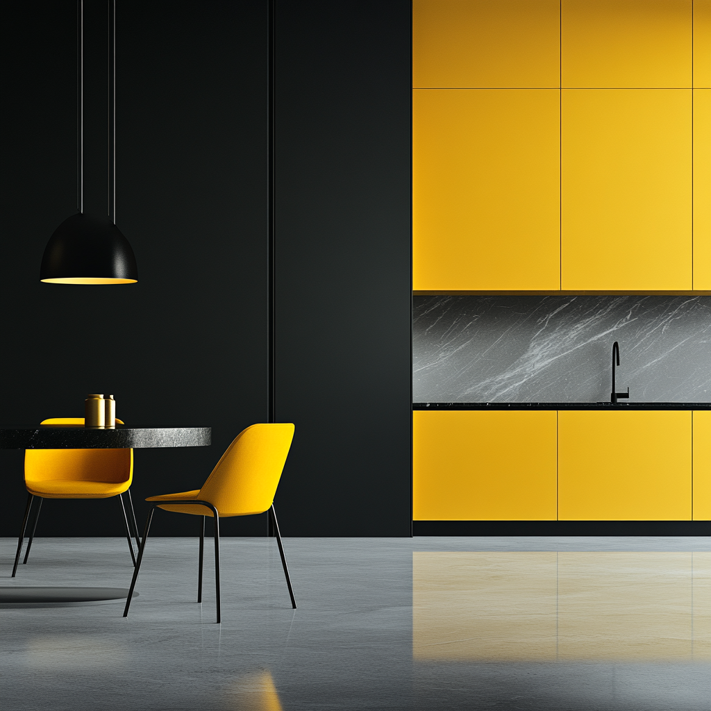
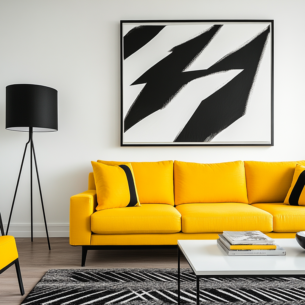
Inspiration and Key Takeaways
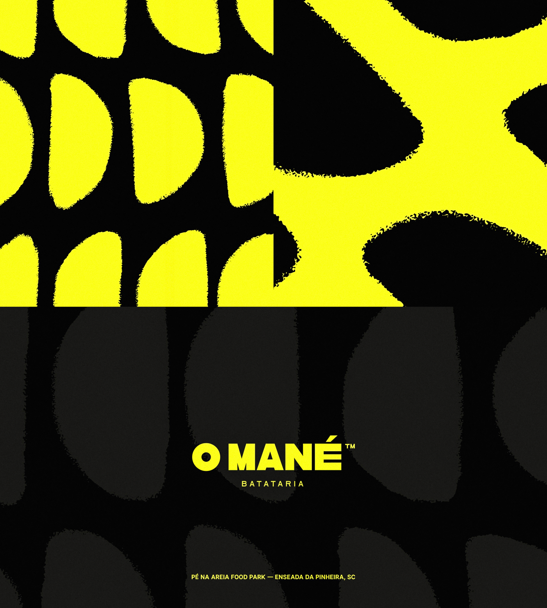
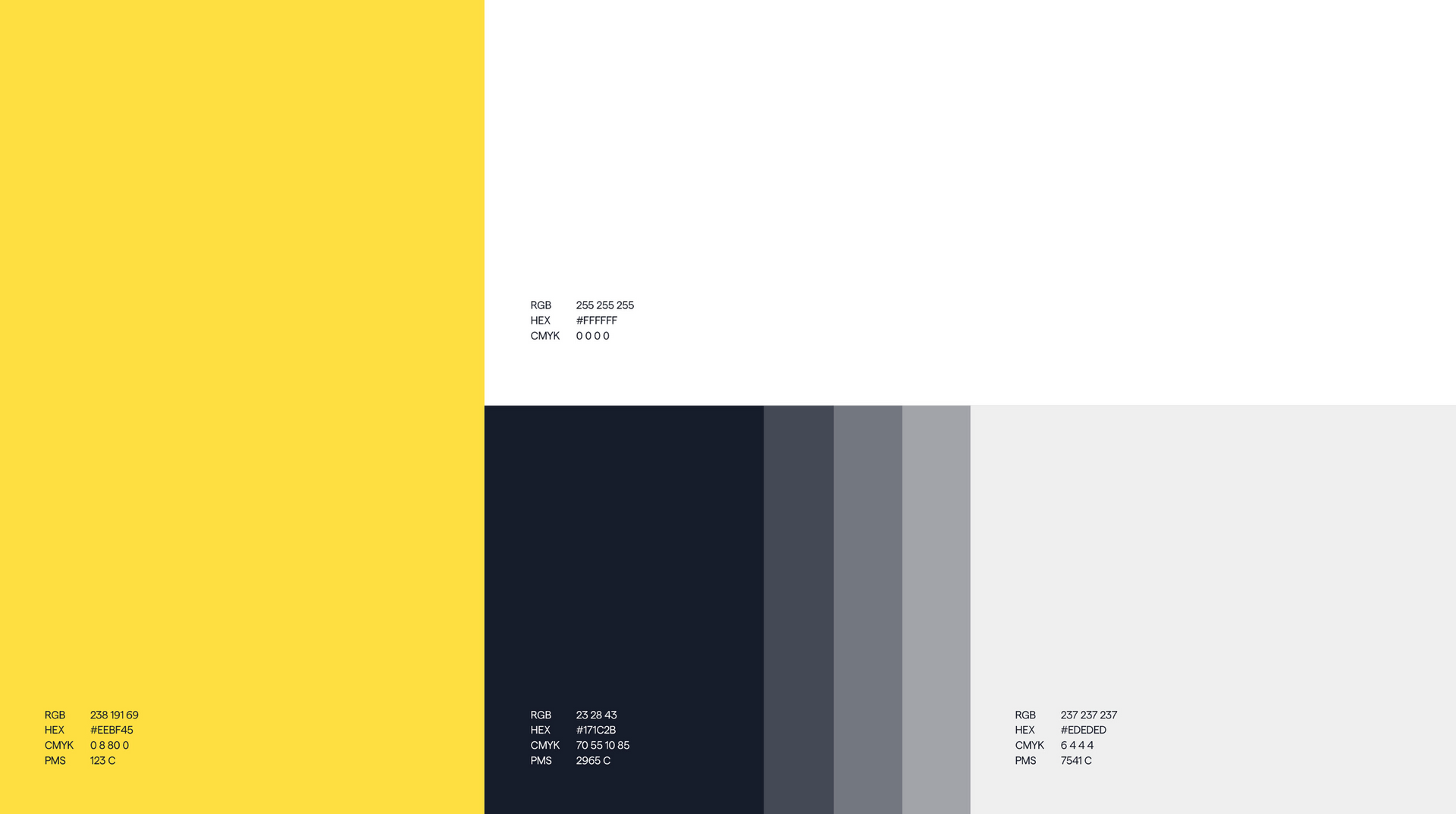
Bold Yellow as the Signature Color
Use bright yellow (or a mustard/gold variation) as the core accent throughout the brand.
Highlight key areas: CTA buttons, header backgrounds, and subtle line accents.
Pair yellow with black, white, and soft grays for a luxurious yet energetic visual balance.
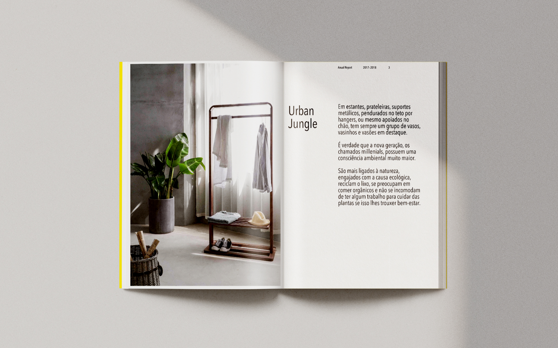
Typography that Balances
Strength and Elegance
Headings: Use bold, condensed sans-serif fonts for assertive, attention-grabbing titles.
Subheadings/Body: Pair with elegant serif fonts for contrast, enhancing readability and luxury.
Prioritize clean layouts with generous white space to allow yellow to 'pop' where needed.
Limit heavy graphics, opting instead for subtle line art, grids, or soft textures.
Patterns and Texture for Depth
Use subtle patterns (grid backgrounds, line art) as a backdrop for branded materials, social media posts, and presentations.
Ensure patterns remain light and minimal, keeping focus on core messaging.
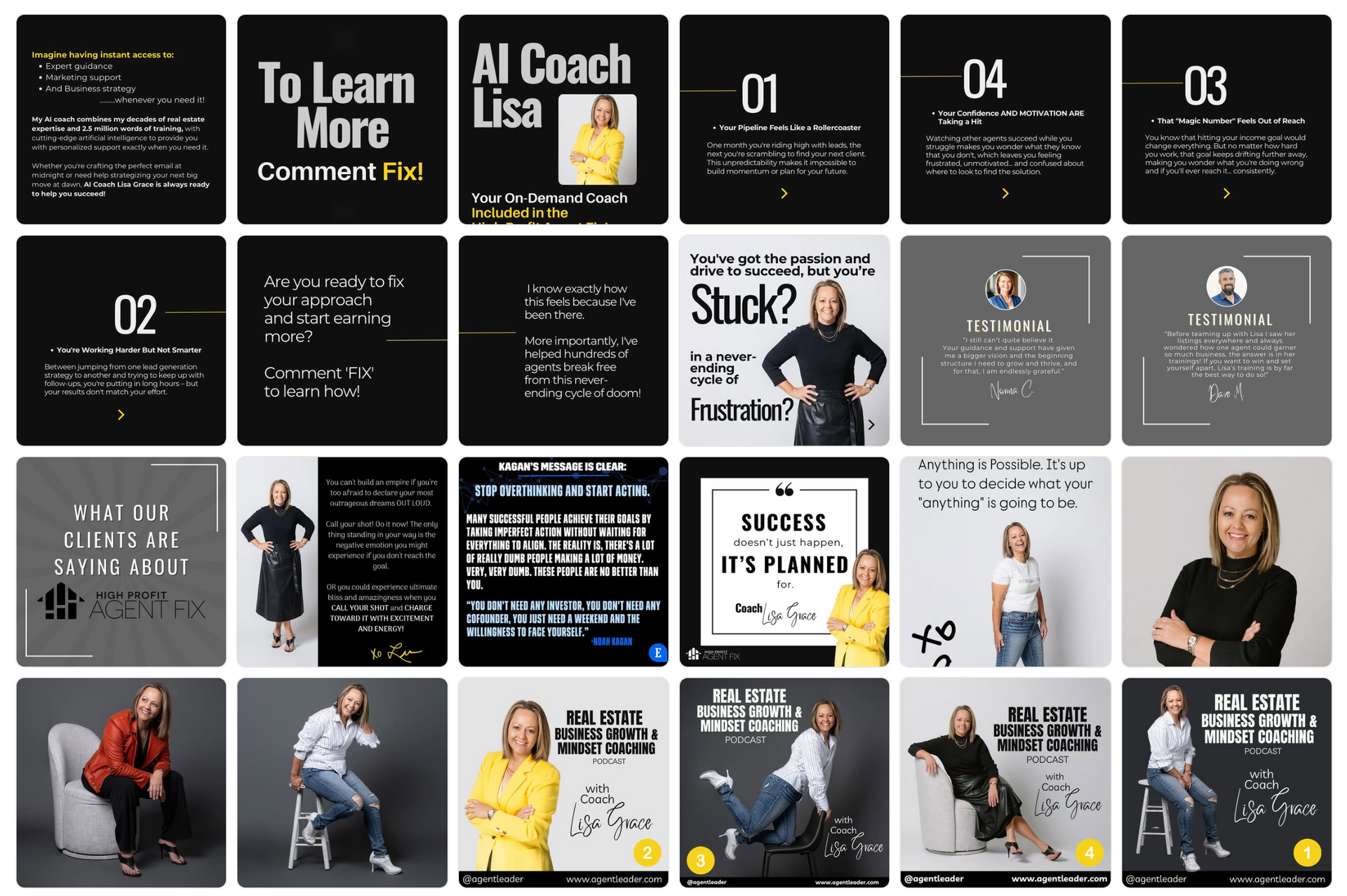
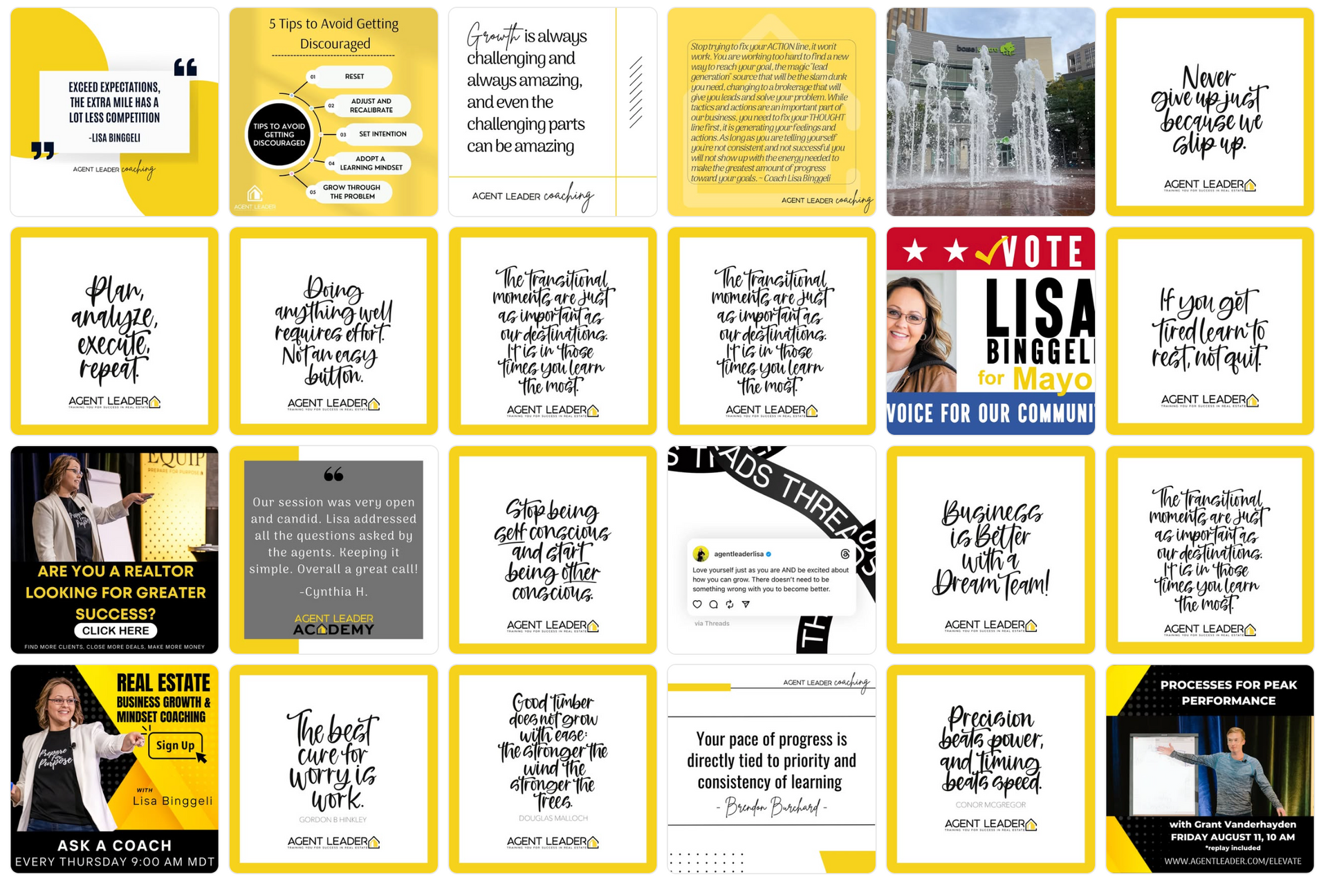
Current Social Media Analysis
The current Agent Leader social media presence reflects a vibrant but somewhat unrefined approach. The heavy use of bold black, white, and yellow text overlays is effective for engagement but lacks the cohesive polish seen with high end brands.
Opportunities for Elevation:
- Refine Color Use: Avoid overuse of bright yellow text on dark backgrounds.
- Typography Refresh: Implement bold, clean typefaces that emphasize clarity and luxury, reducing text-heavy posts.
- TEXT: META (IG/Facebook) now understands SEO (things like text in the body of a post are very important).
- Minimalism and White Space: Introduce more white space in layouts to create visual breathing room.
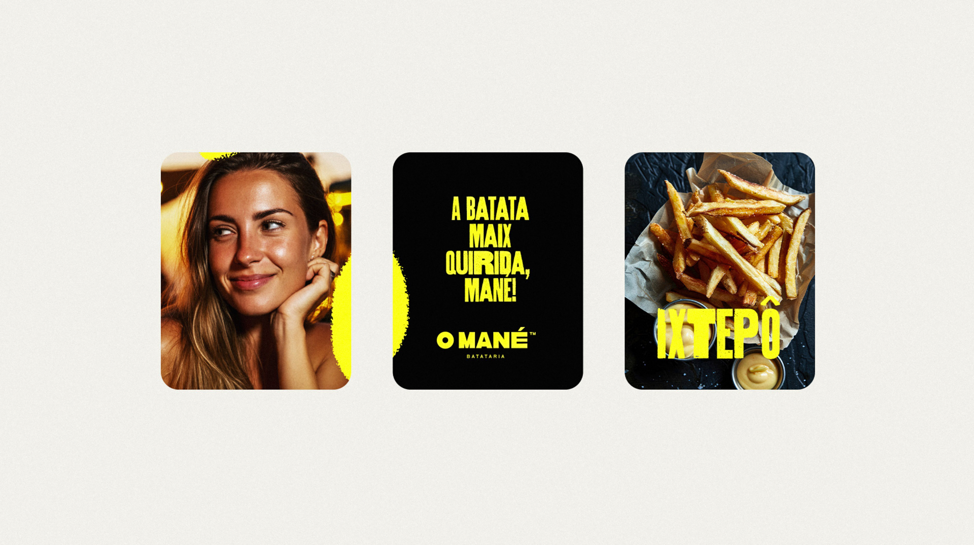
- Imagery First Approach: Incorporate more aspirational lifestyle imagery, utilizing yellow as an accent rather than a dominant color.
- We can achieve this with AI (using MidJourney to build our own unique style tone).
New Social Media Ideas


WANT TO WORK TOGETHER?
Please fill out the form below to arrange a call or quote.
We typically reply to enquiries within 24 hours.