CENTURION ONE CAPITAL
Centurion One Capital has undertaken a brand refresh to modernize its image while preserving its core values of strength, leadership, and prosperity. The original logo, with its golden 'C' helmet and simple typography, projected luxury and authority. However, to reflect the company's growth and forward-thinking spirit, a more contemporary design was needed.
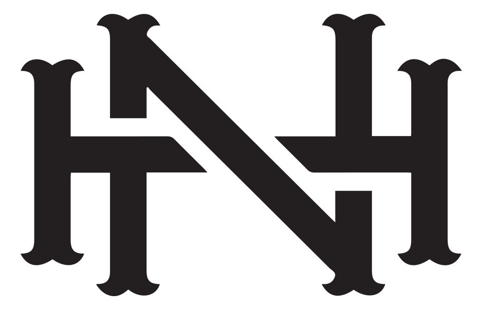
The redesigned logo retains the iconic centurion helmet, now more dynamic, and the stylized "C" has been polished for a cohesive look. The updated typography features a modern yet sophisticated typeface, enhancing readability and professionalism. Subtle adjustments to the colour palette maintain the brand's high-end feel while ensuring better visual appeal.
This brand evolution positions Centurion One Capital as an innovative leader in the financial sector. The new logo is versatile across various mediums, ensuring the brand stands out in every context. By embracing this modernized identity, Centurion One Capital continues to build on its heritage, connecting more effectively with its audience and setting the stage for future growth.
Creative Direction
RE-Branding - New Logo Creation
Website - Coming Soon
THE NEW LOOK


THE PREVIOUS DESIGN
The original logo of Centurion One Capital, while attempting to convey strength and luxury, falls short in several key design aspects, giving it an amateur disjointed appearance.
- Poor Symbol and Typography Integration: The golden centurion circle and stylized 'C' are disjointed and lack harmony, making the logo feel unfinished.
- Typography Issues: The font choice and sizing are disproportionate, resulting in an awkward composition. Centred text to left justified logo.
- Flat Color Scheme: The gold appears flat and lacks depth, failing to convey the intended luxury.
- Professionalism: The overall design lacks polish and cohesion.
RELATED PROJECTS