
Bold Meets Grace: Embracing a Feminine Approach in Design
In the creative world, especially in industries like food and beverage, my work has typically leaned towards strong, bold, and assertive visual styles. These elements are familiar and essential for brands that demand immediate attention and stand firmly in the spotlight.
But recently, I’ve joined
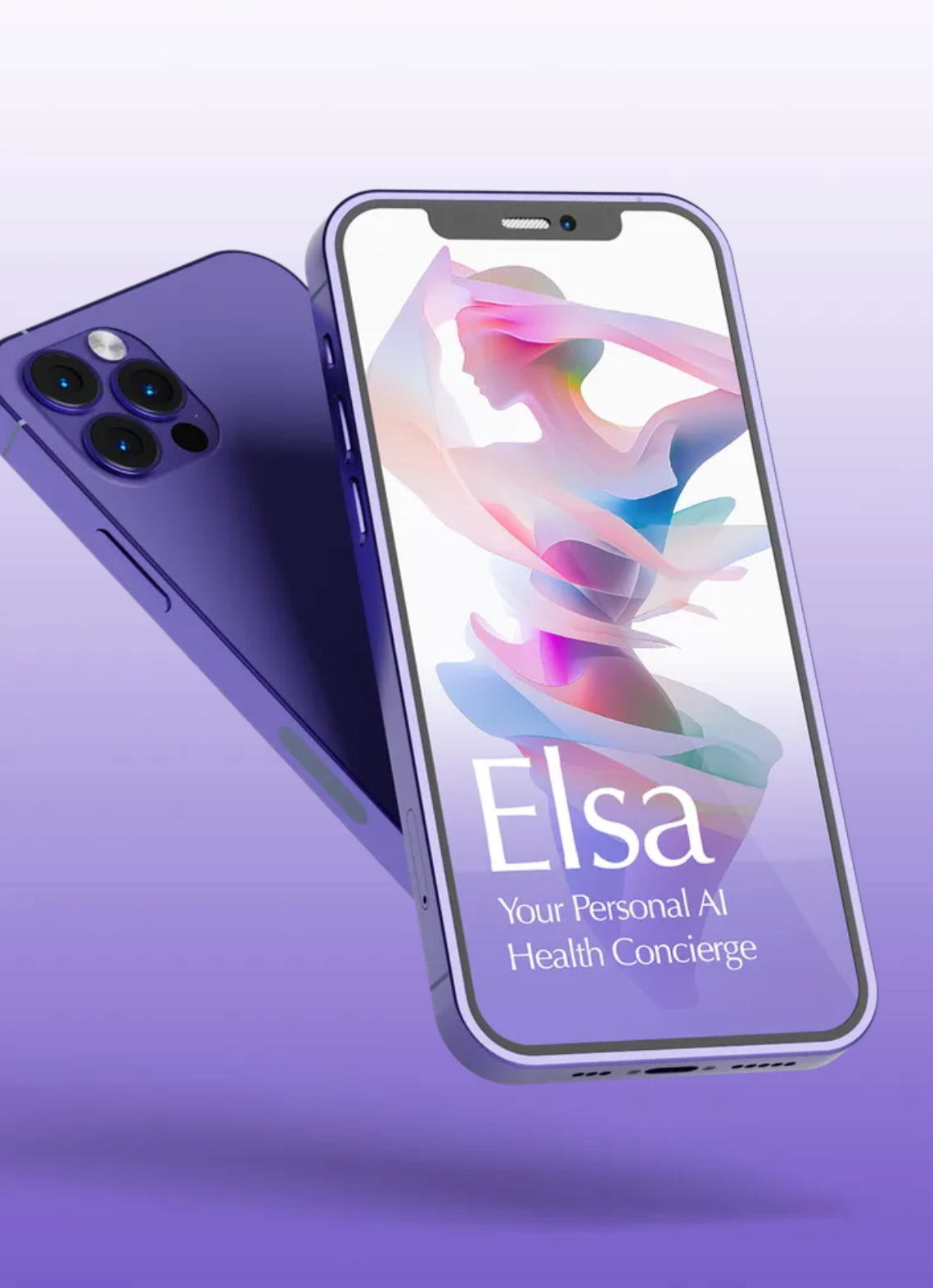
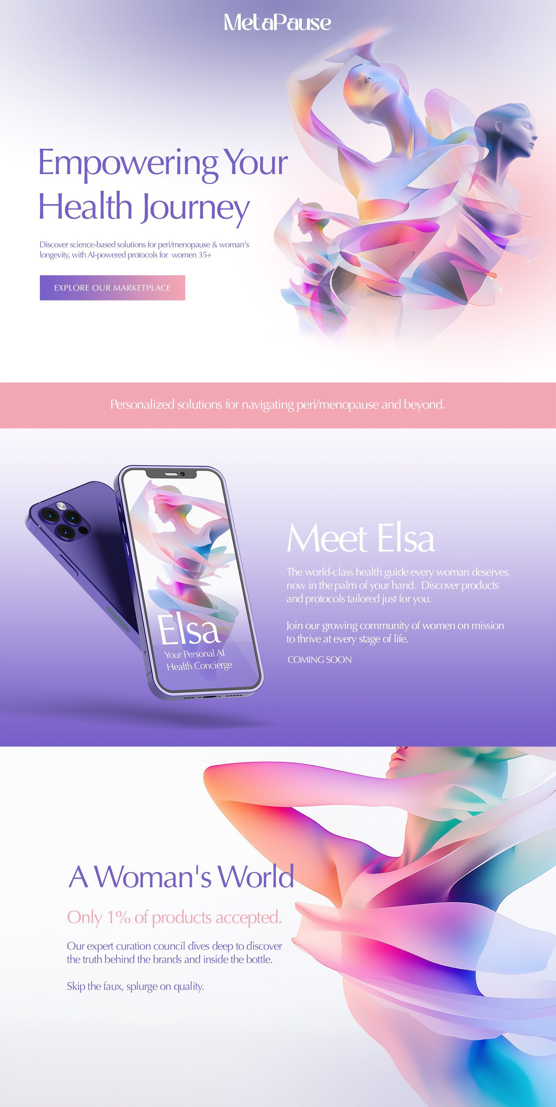
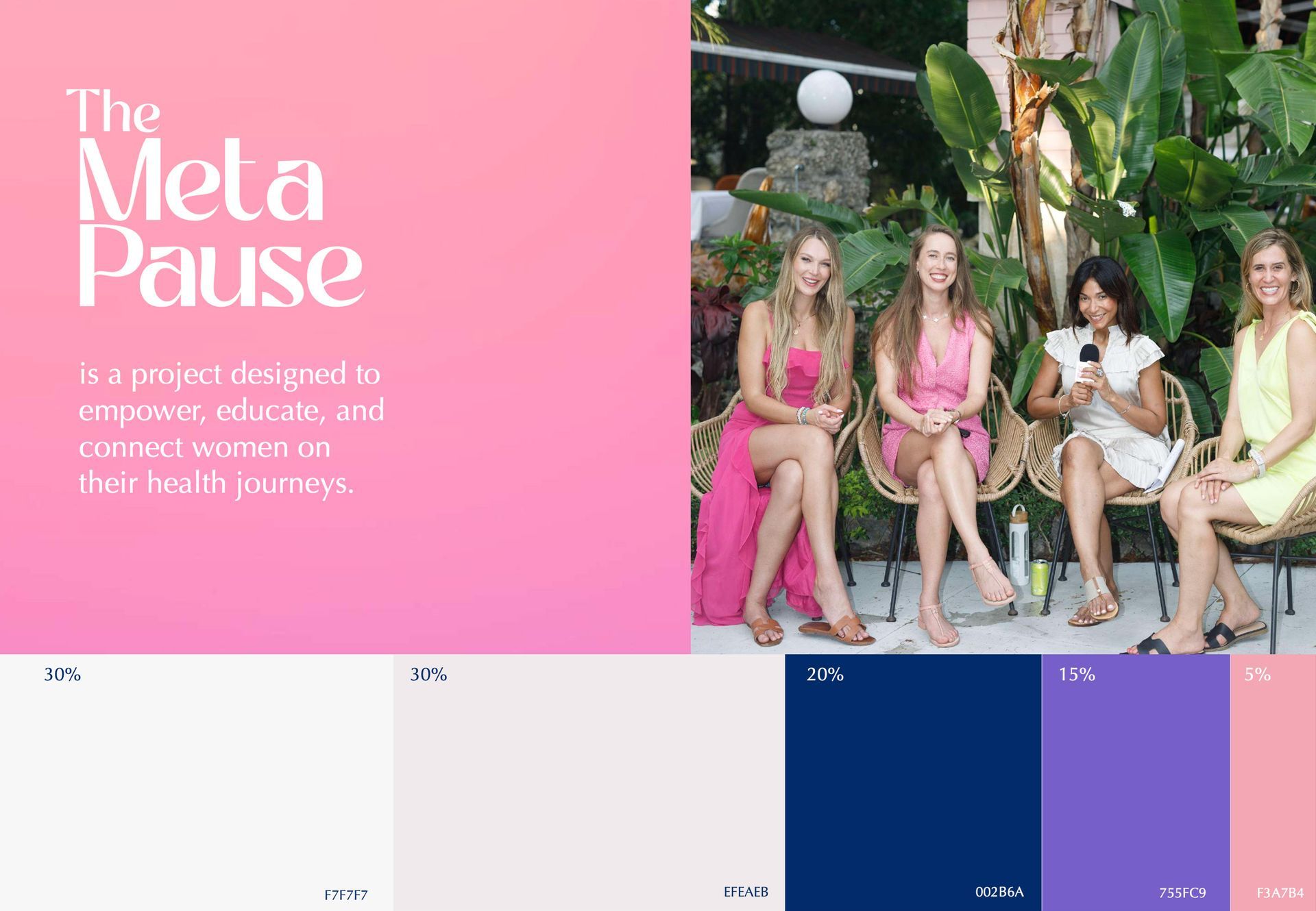
The MetaPause—a health-focused brand speaking directly to empowered women navigating the nuances of menopause—as a creative consultant, guiding their brand identity through a refined, feminine lens. This role as an advisory creative director is part of my broader consulting work, where I help multiple brands reshape their visual narratives. With The MetaPause, it’s been about more than just a visual shift; it’s about understanding, adapting, and honoring a design aesthetic that champions femininity in a way that’s both powerful and graceful.
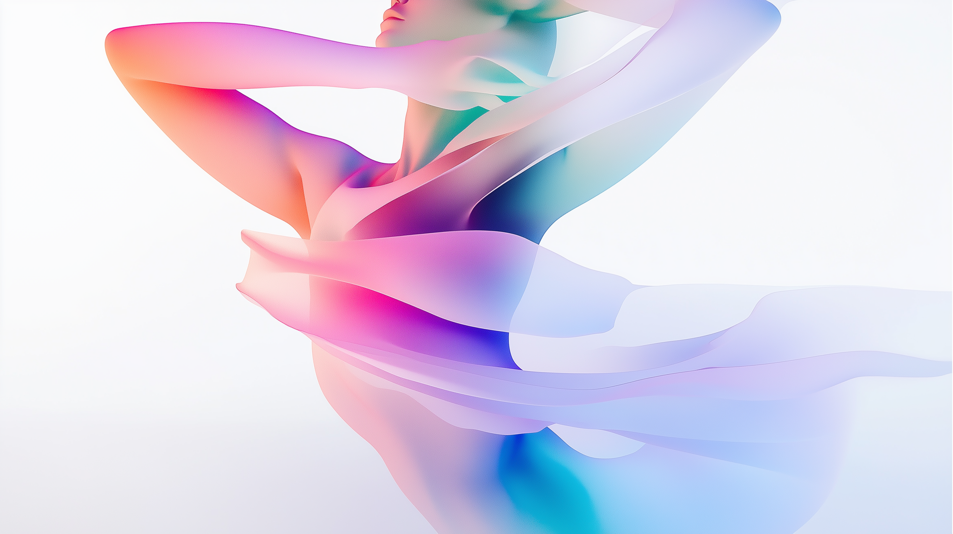
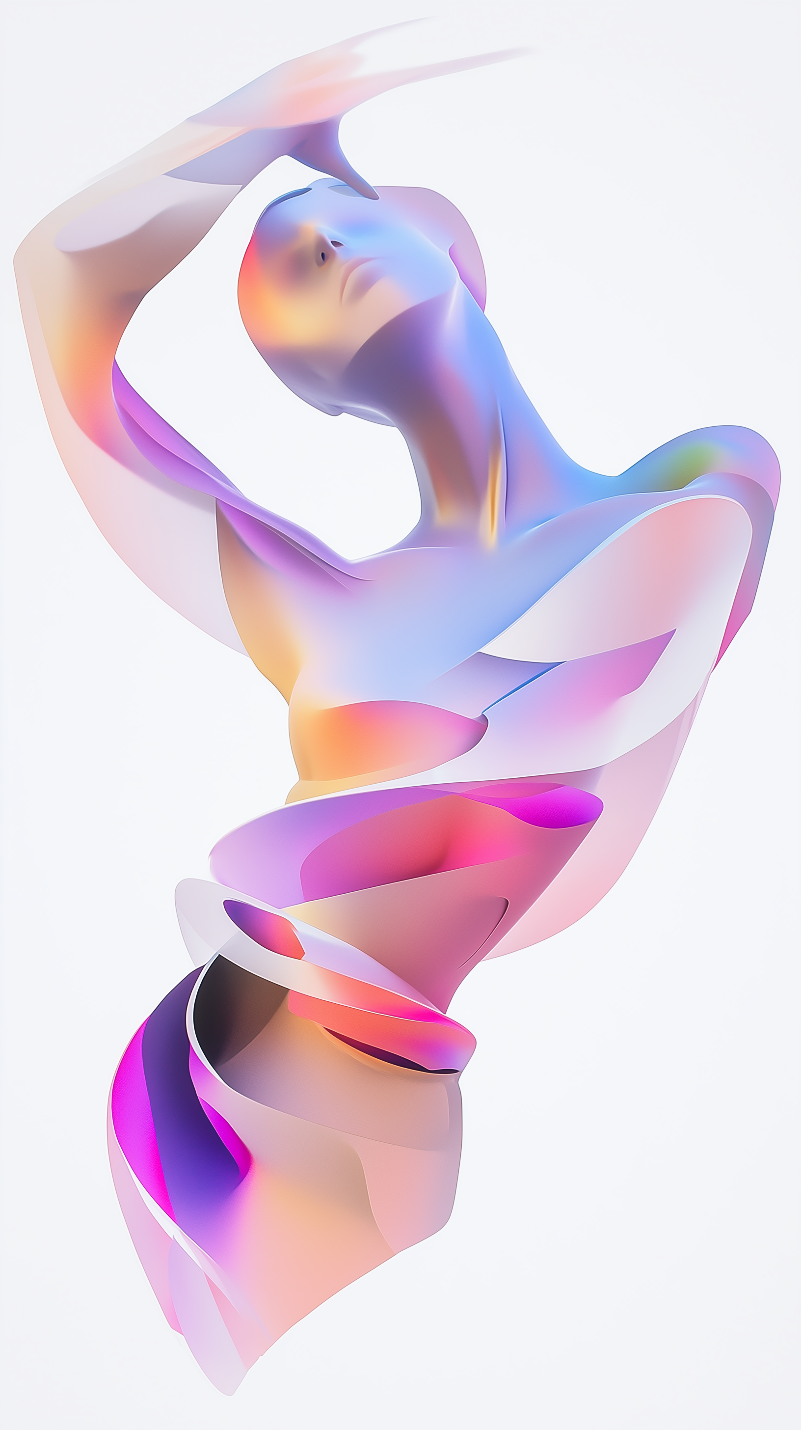
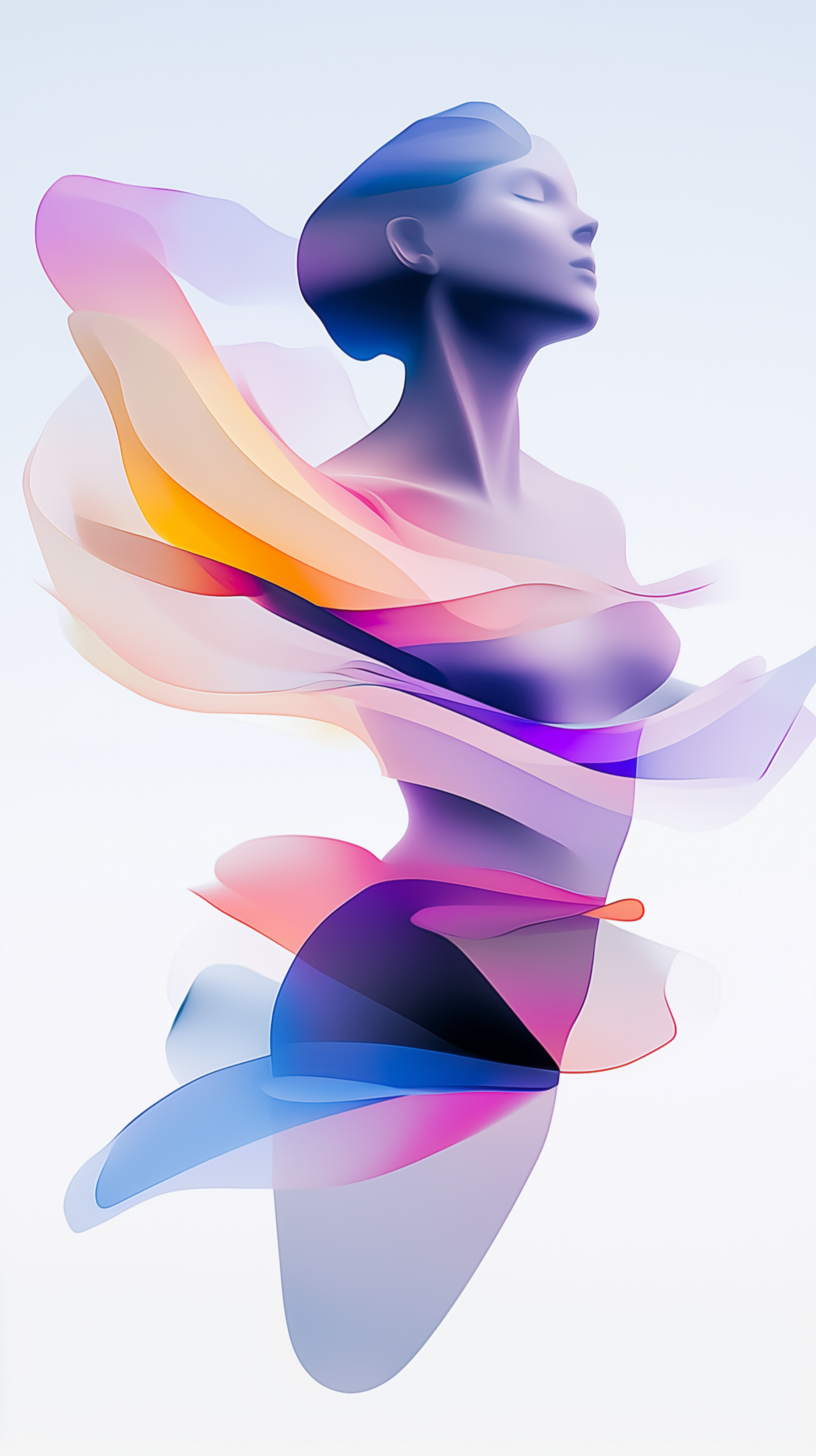
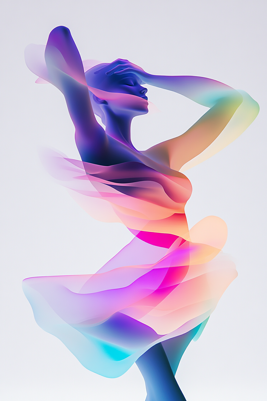
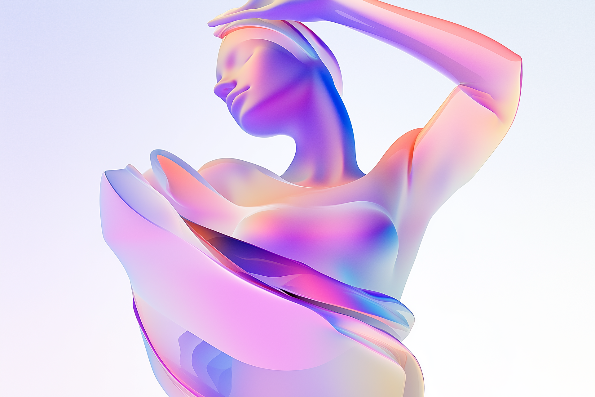
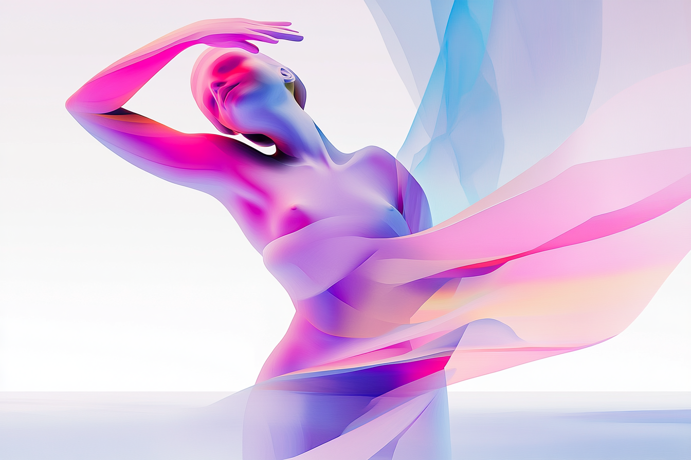
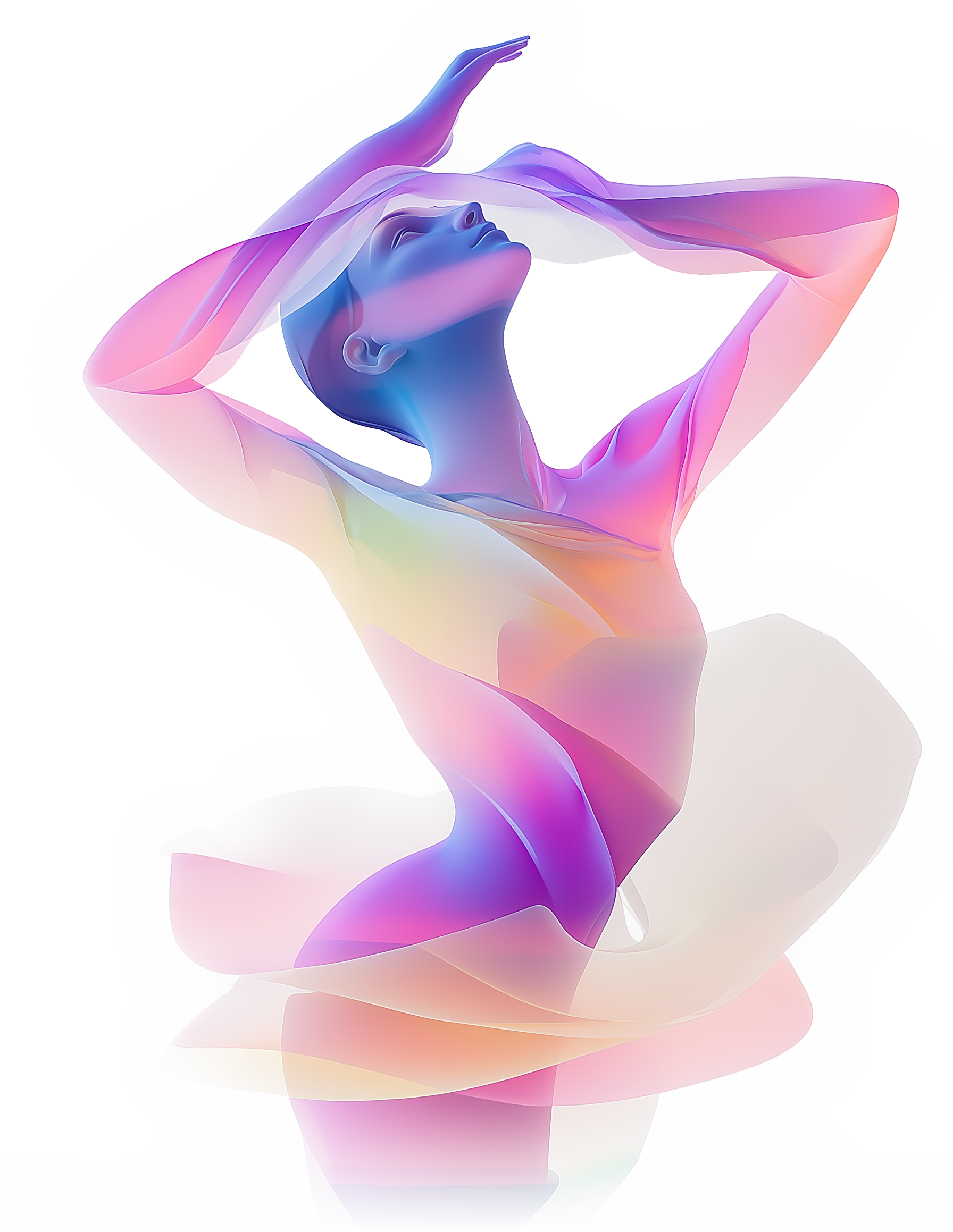
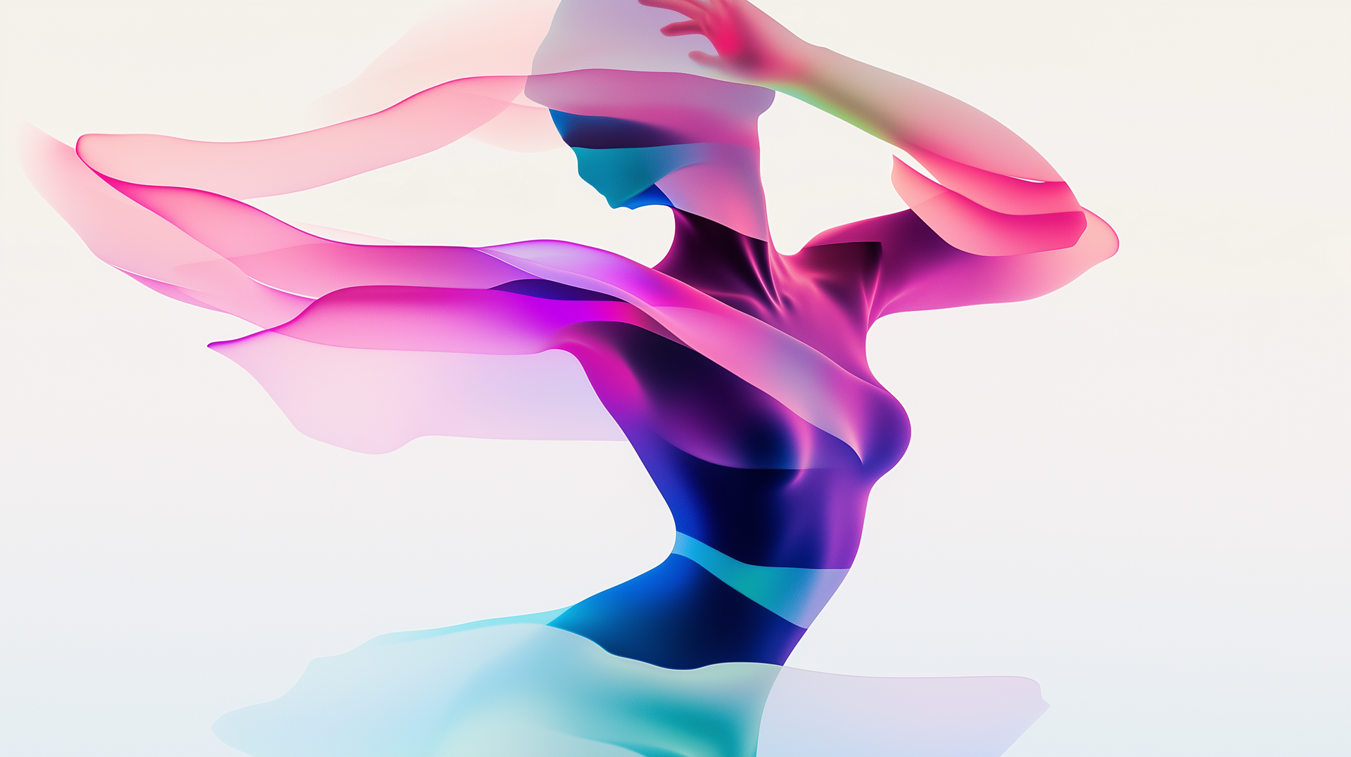
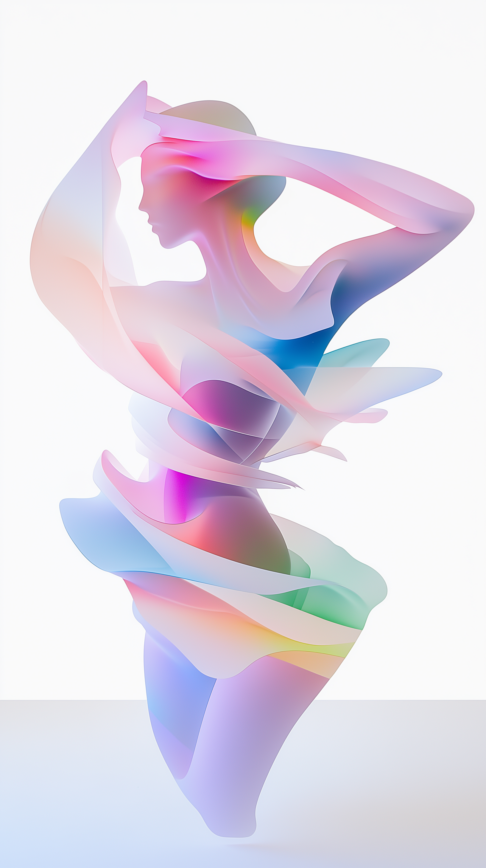
The MetaPause is all about flow, balance, and resilience, values that shape both its identity and the women it serves. In branding for this audience, I’ve found myself exploring softer palettes and curvier, flowing lines that embody femininity without compromising strength. Working with these elements is about layering in the same boldness I bring to food and beverage brands, but refining it with an elegance and nuance that speaks directly to an audience that values authenticity and depth over flashiness.
Colors That Speak to Femininity
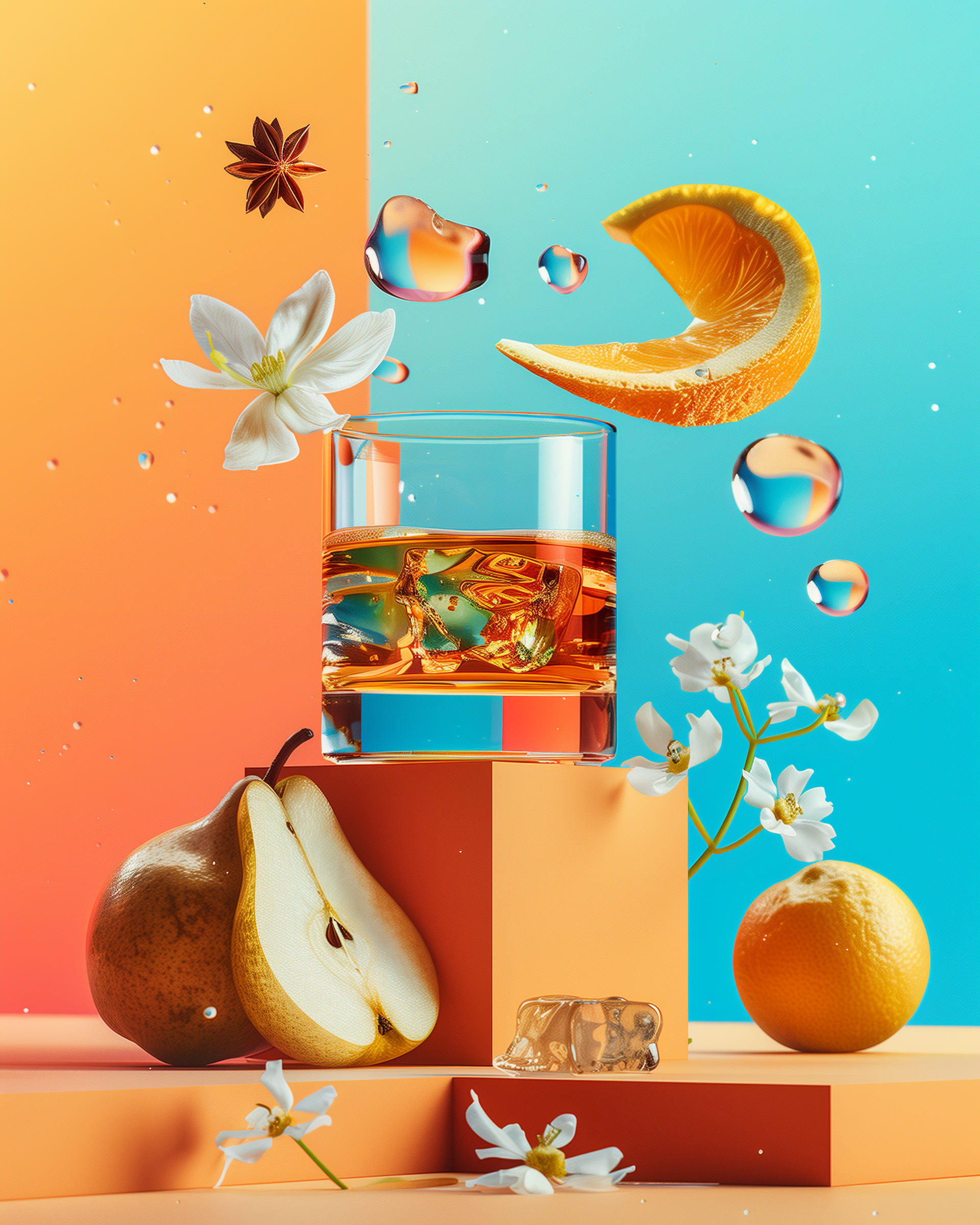
Color choice has been one of the most transformative aspects of this project. Where bold brands might rely on deep blacks, intense reds, and high-contrast pairings, The MetaPause embraces tones that are gentle yet firm. Think soft mauves, muted blushes, and shades that transition smoothly. These colors evoke a sense of calm and openness—qualities that resonate deeply with an audience that values both strength and comfort in their journey.
When designing for a brand that seeks a more feminine touch, it’s less about dialing down intensity and more about finding colors that reflect inner resilience and openness. Each hue on the screen or page isn’t just there to look good; it tells a story, symbolizing a connection to a community that appreciates subtlety and sophistication.
Flowing Lines and Curved Forms
Working with The MetaPause has allowed me to explore shapes and lines that flow organically—curves over angles, soft edges over hard cuts. These shapes aren’t just design choices; they reflect the journey of the women we’re speaking to, who embrace change gracefully and flow with life’s currents. Curves bring a sense of approachability to the design, communicating warmth and inclusiveness, which are pillars of the brand’s ethos.
A Balanced Design Language for a Powerful Audience
This experience has opened my eyes to the strength that lies in balance. While bold designs capture attention, balanced, feminine aesthetics invite connection. This approach invites viewers to pause, feel, and engage with the content on a deeper level. It’s not about creating a softer brand; it’s about crafting a nuanced, empowered message that speaks with confidence and poise.
As I continue on this journey with The MetaPause, I’m reminded that the best design isn’t about fitting into a box—masculine or feminine, bold or subtle. It’s about creating spaces and stories that resonate with people’s experiences and aspirations. Embracing a feminine approach isn’t just a departure; it’s an expansion of what it means to create with intention, to design with empathy, and to connect authentically.