
COPY NOTHING: Breaking Down Jaguar's WILD Transformation
Jaguar has sent shockwaves through the automotive and design worlds with its daring new rebrand. As a designer and all around creative, I find myself simultaneously intrigued, inspired, and a bit perplexed by this audacious pivot.
It’s a bold move that deserves closer examination—because love it or hate it, everyone’s talking about it. Let’s dive into what Jaguar is doing, why it’s creating such a stir, and what this means for the brand moving forward.
A Brave New Aesthetic
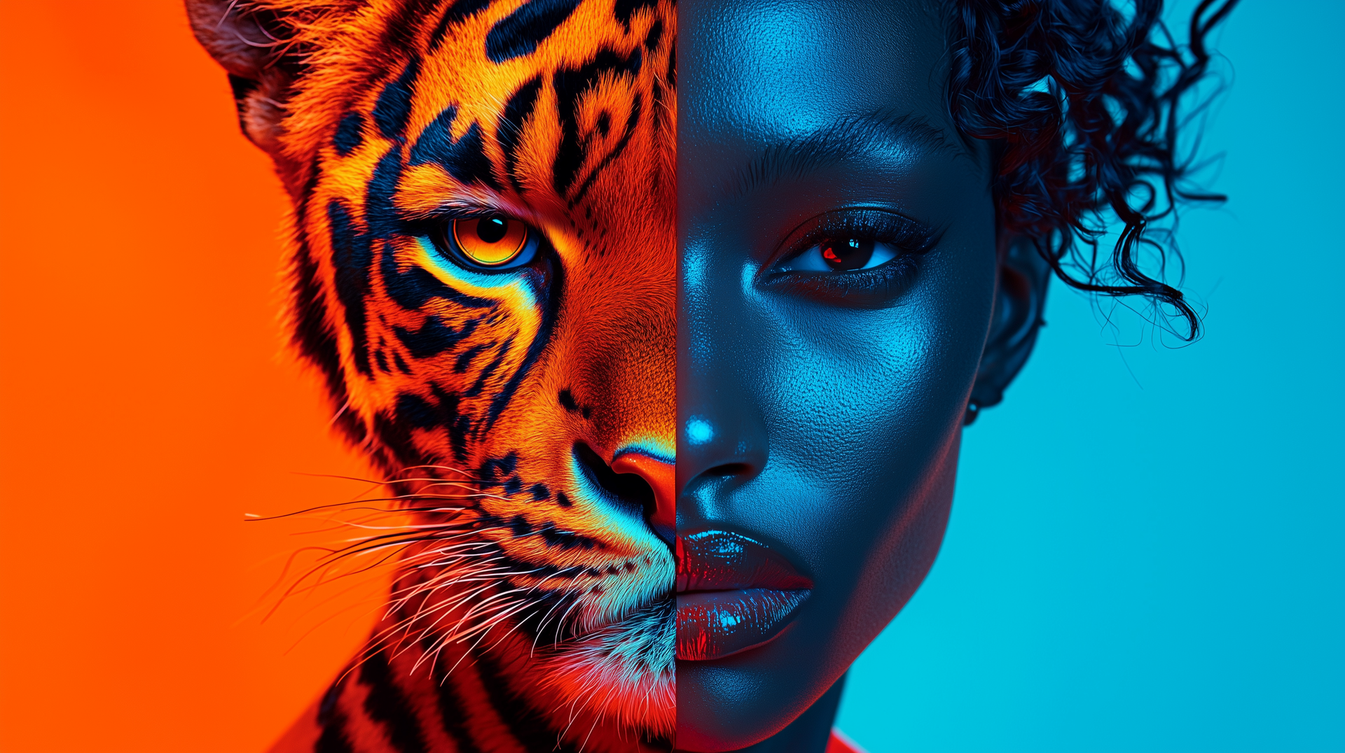
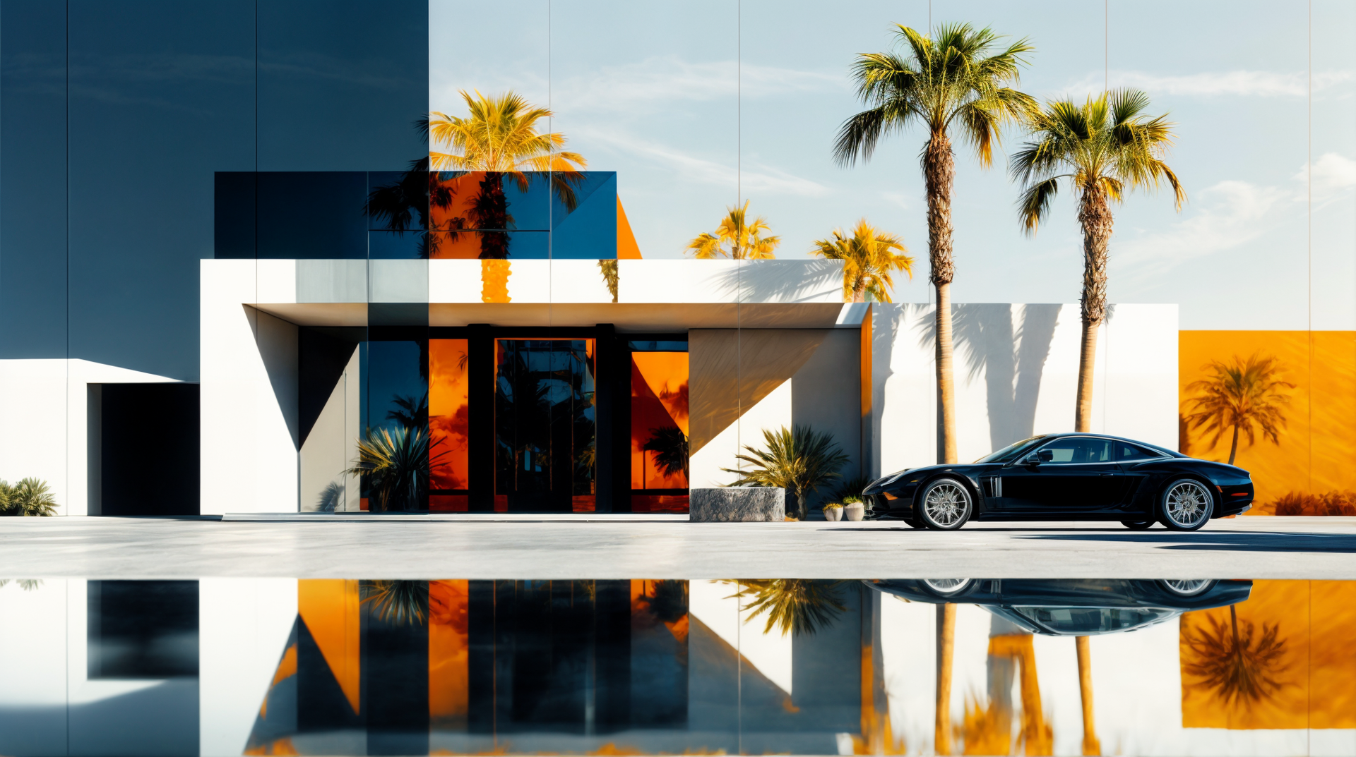
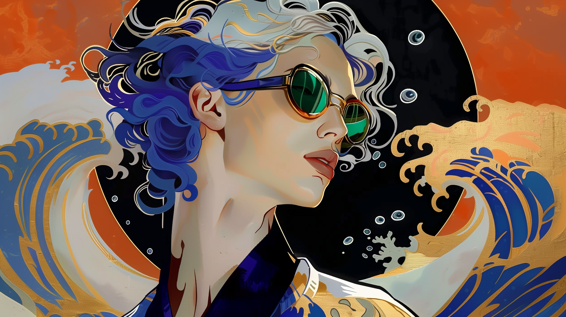
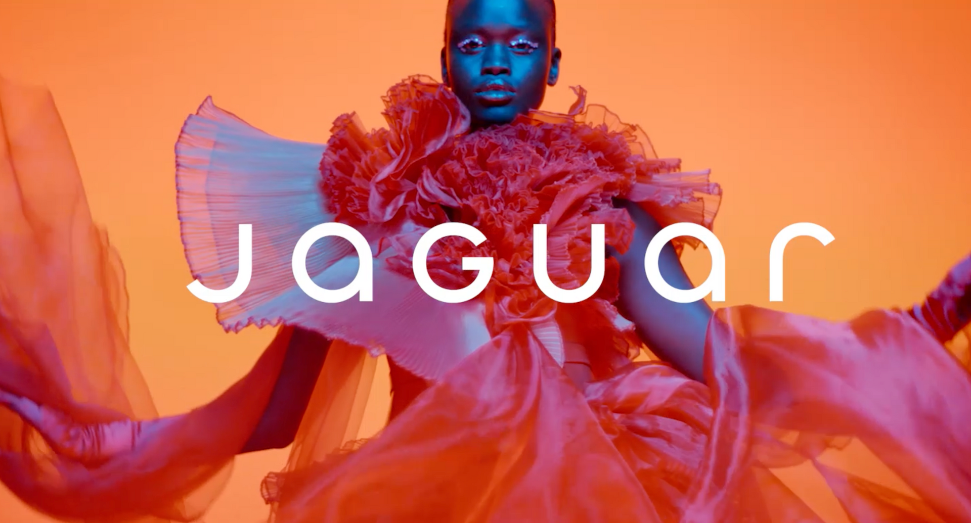
The rebrand is unlike anything we’ve seen in the automotive world. Jaguar’s visuals are dripping with high-fashion energy, leaning into vibrant palettes of reds, oranges, and yellows that scream boldness, rebellion, and youth. Gone are the days of sleek sophistication defined by minimalist silver tones and understated elegance. Instead, Jaguar seems to be signaling a reinvention: a brand unafraid to experiment, disrupt, and stand out.
But here’s where it gets polarizing: Jaguar’s visuals have very little to do with their cars—or at least what we traditionally associate with them. Where are the vehicles? The growling jaguar emblem? The unmistakable sleekness that has defined their legacy?
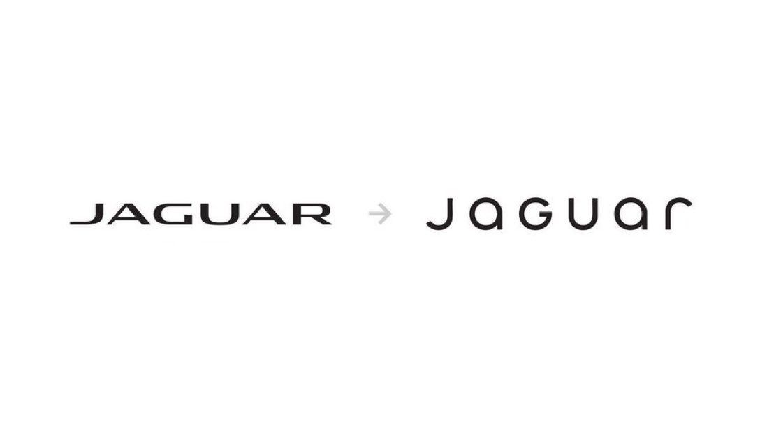
Instead, we’re met with a capital 'G' in the new “JaGUar” logo—a decision some are calling innovative while others view it as jarring and disjointed. The campaign features a diverse lineup of models in avant-garde fashion, and it’s hard to tell if this is a luxury car ad or a haute couture editorial. One thing is clear: they’re reaching for something very different.
THE BUZZ FACTOR
Say what you will about the rebrand, but Jaguar has accomplished one critical goal: people are talking about it. Articles, design forums, and even casual car enthusiasts are weighing in on this transformation. That level of attention is no small feat in today’s saturated media landscape.
The question is whether this buzz will translate into reinvigorated sales. Jaguar’s numbers have been in free fall, with U.S. sales plummeting 70% over the past five years. Clearly, something had to change. But is this rebrand the right change?
Breaking Down the Strategy
From a purely strategic perspective, Jaguar’s choices are risky—and risks can pay off big or backfire spectacularly. Let’s analyze the pros and cons of this bold transformation:
The Positives:
- Cultural Relevance: The campaign’s high-fashion aesthetic taps into the zeitgeist of bold individuality and artistic expression.
- Fresh Energy: Jaguar feels younger and edgier than it has in years, potentially appealing to a new audience.
- Massive Visibility: The rebrand is creating conversation across industries, putting Jaguar back in the spotlight.
The Risks:
- Heritage Disconnect: Jaguar was once synonymous with classic British luxury and elite engineering. This new direction feels detached from its roots.
- Audience Confusion: Who is this rebrand for? Traditional enthusiasts might feel alienated, and the target audience remains unclear.
- Substance vs. Style: Without innovative new models to back this up, the campaign risks being dismissed as all flash and no substance.
What Jaguar Could Have Done Differently
The timing of this rebrand is also worth considering. We’re living in an era of nostalgia, where consumers crave tradition and heritage. Jaguar had an incredible opportunity to lean into its iconic history—classic sophistication paired with cutting-edge innovation could have been a powerful story. Imagine a retro-inspired campaign with a 70s aesthetic contrasted against state-of-the-art electric vehicles. Instead, Jaguar opted for a fashion-forward approach that feels a bit... lost.
Another missed opportunity lies in messaging. The campaign celebrates "collaborating with a collective of original creators across the arts." That’s great for an art installation, but Jaguar’s #1 priority right now should be selling cars. Where’s the emphasis on performance, innovation, or engineering excellence? Art grads don’t build cars—engineers do. Jaguar’s messaging should reflect that.
Where Does Jaguar Go From Here?
Jaguar’s next moves will define whether this rebrand is a triumph or a misstep. If this campaign is supported by bold new models, revolutionary engineering, and a cohesive narrative, it could signal the start of a remarkable comeback. Imagine Jaguar introducing electric vehicles in daring colors, blending cutting-edge technology with this bold new identity. Suddenly, this aesthetic gamble would make sense.
But if this is just a flashy rebrand with no tangible connection to the product lineup, it risks fading into irrelevance. The buzz will die down, leaving behind a confused audience and an orphaned brand.
Lessons for Designers and Brands
Jaguar’s transformation is a case study in the power of bold creativity—and the fine line between brilliance and bewilderment. For designers, it’s a reminder that aesthetic risks can pay off, but they need to be grounded in strategy. For brands, it’s proof that rebrands aren’t just about visuals—they’re about storytelling, legacy, and clarity.
Whether you love or hate this new direction, one thing is certain: Jaguar has reignited a conversation about its brand. Now it’s up to them to steer the narrative—and their cars—back on track.
What’s your take on Jaguar’s rebrand? Do you see it as a bold leap into the future or a misguided departure from their roots? Let me know in the comments!