
Chromafusion: A Journey Through Childhood Memories and Artistic Inspirations
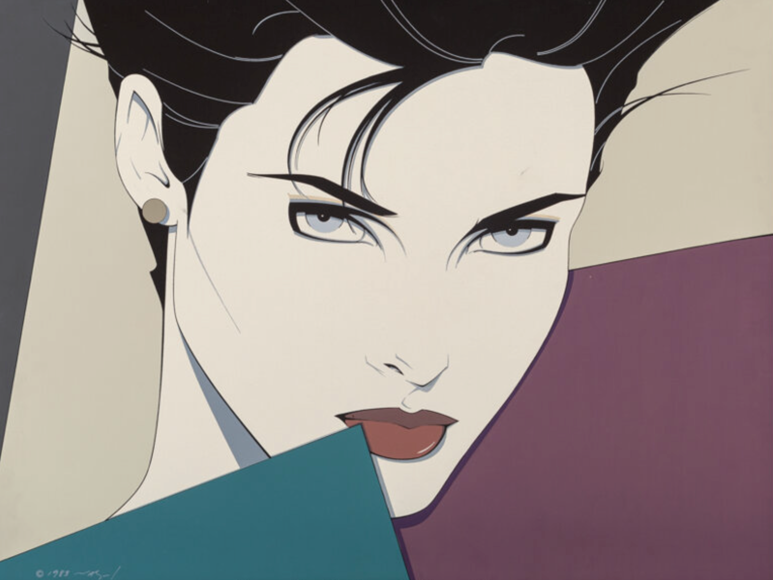
Growing up, my home was filled with various forms of art, but there was one piece that always stood out to me—a painting by Patrick Nagel. My father, Steve Harborne, had this painting prominently displayed on the wall, and as a child, I found myself endlessly fascinated by it.
I didn't fully understand the style or the depth of Nagel's work until I was much older, but I always knew I loved it. This early exposure to art had a profound impact on me, shaping my appreciation for modern art and influencing my own creative journey. I don't think my father knows this, but that painting was a core memory.
Childhood Memories and Early Influences
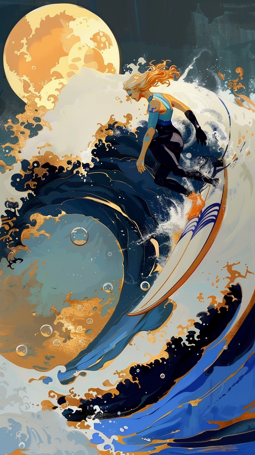
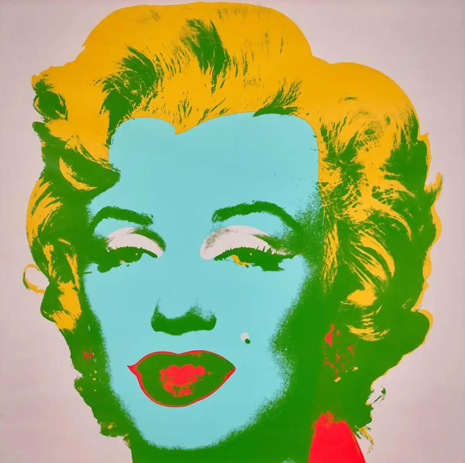
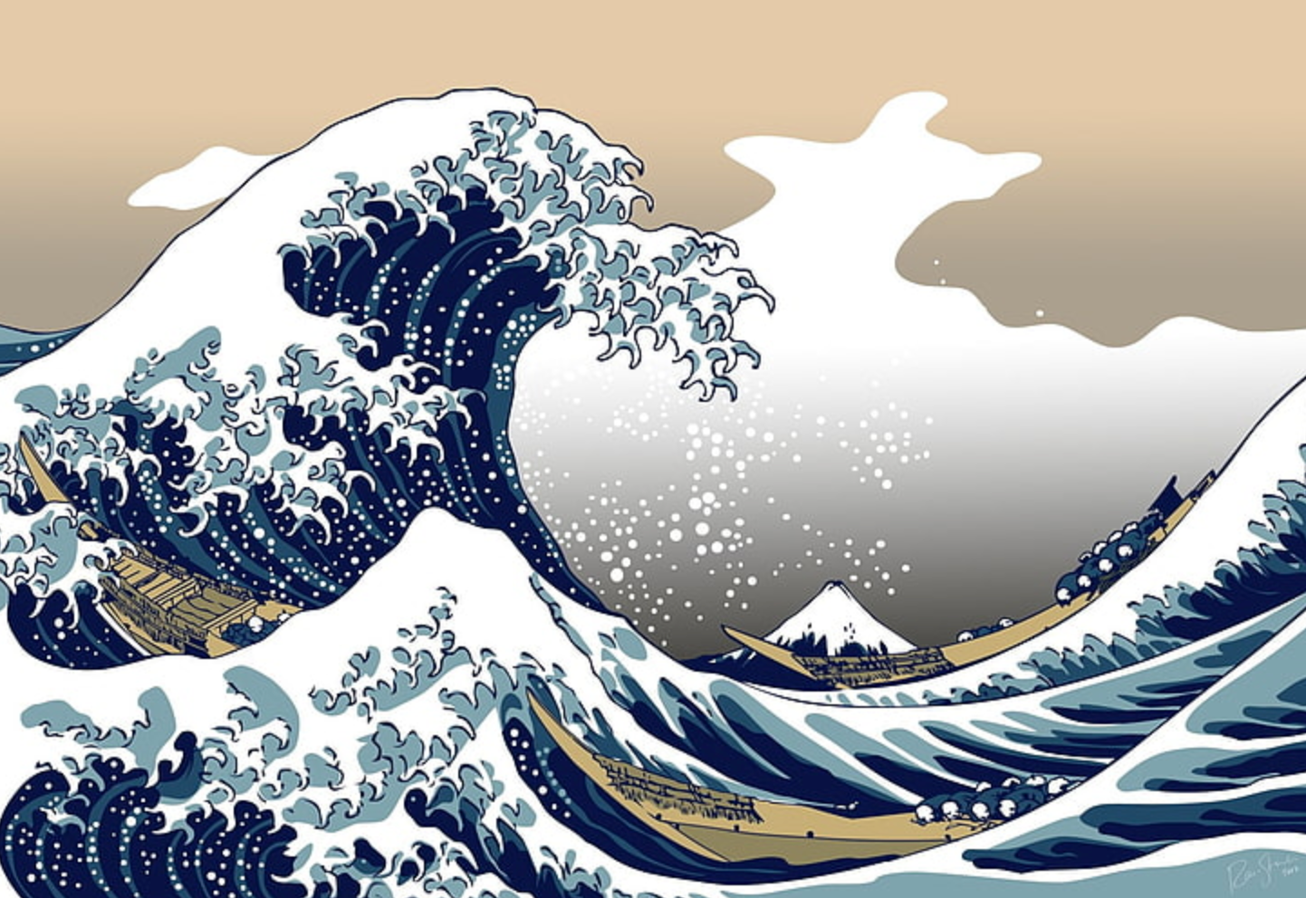
Nagel's painting, with its bold colors and minimalist lines, was a constant source of intrigue. It wasn't just a piece of art; it was a gateway to a world of creativity and imagination. As I grew older, my fascination with Nagel's style deepened, and I began to explore other artists who had similar impacts on me. Andy Warhol's pop art, with its vibrant colors and cultural commentary, further fueled my love for modern art. Additionally, the works of Katsushika Hokusai, particularly his iconic painting "The Great Wave off Kanagawa," introduced me to the beauty of Japanese art and its powerful use of color and form.
The Birth of Chromafusion
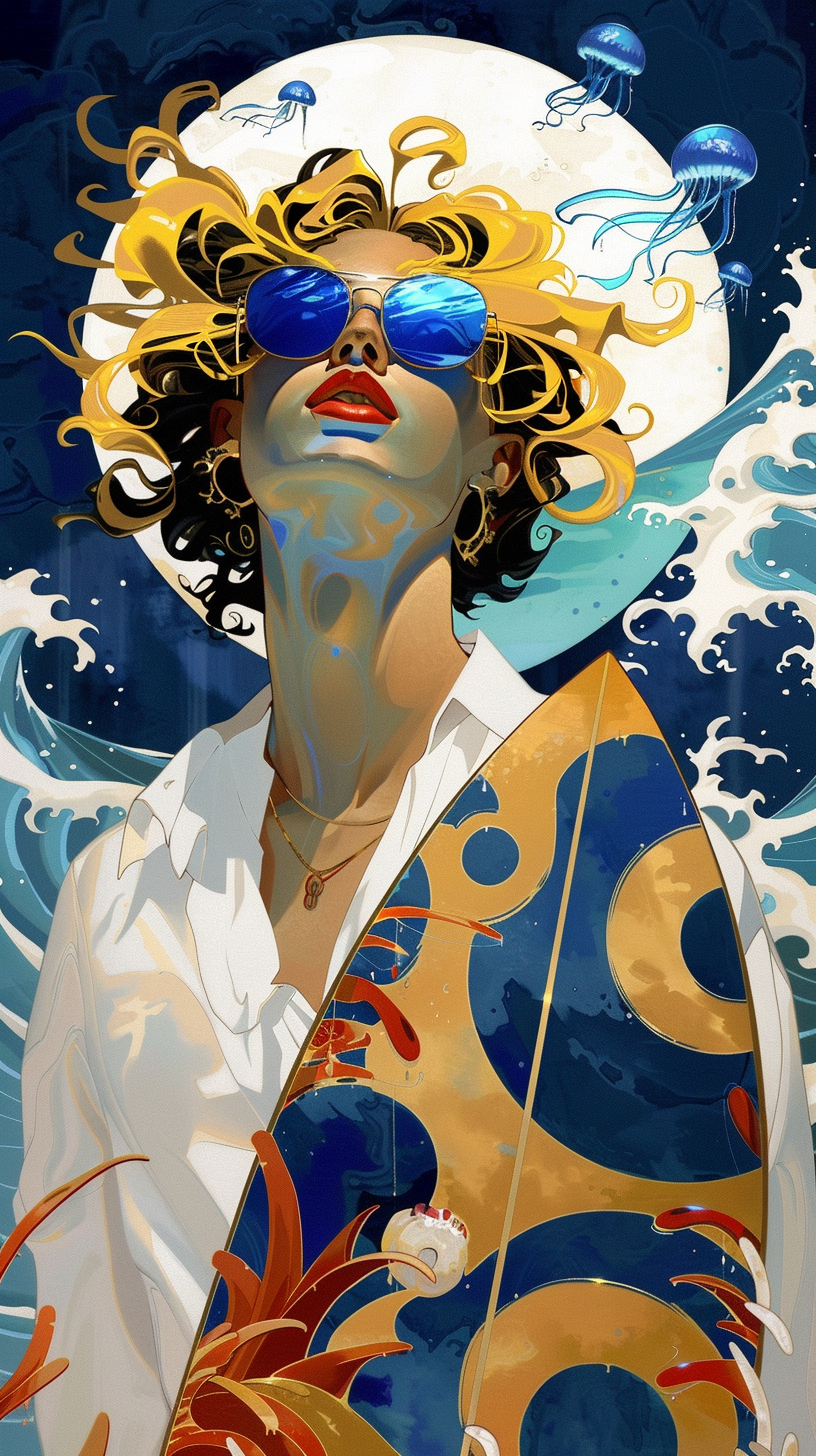
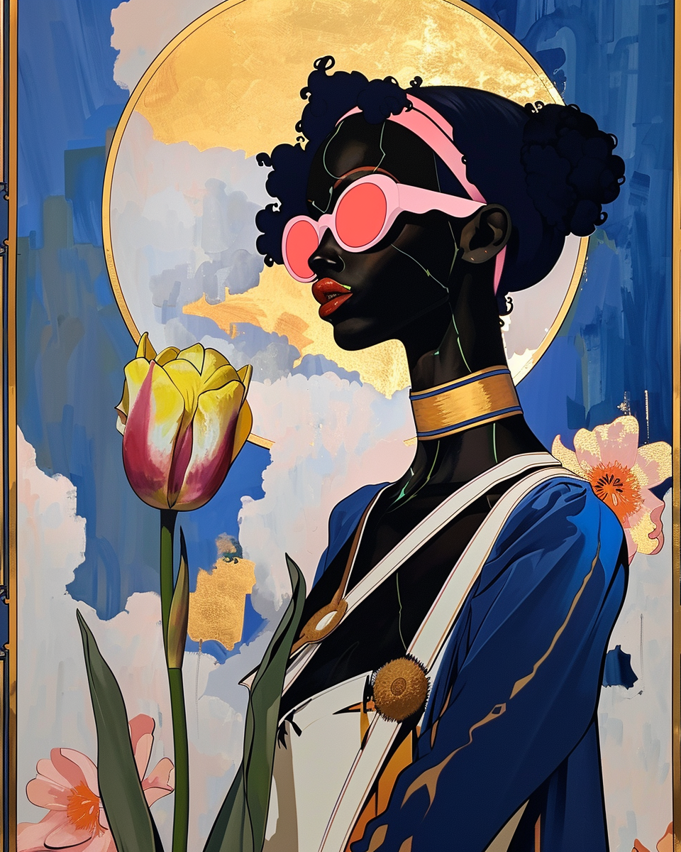
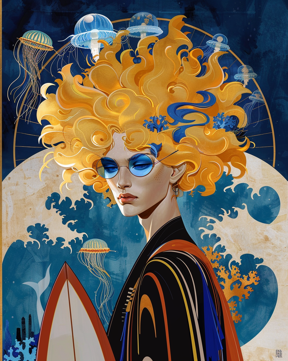
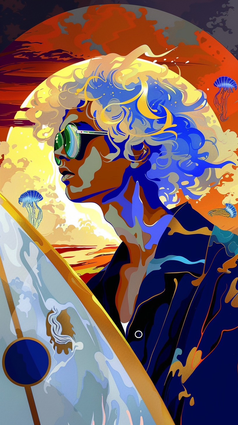
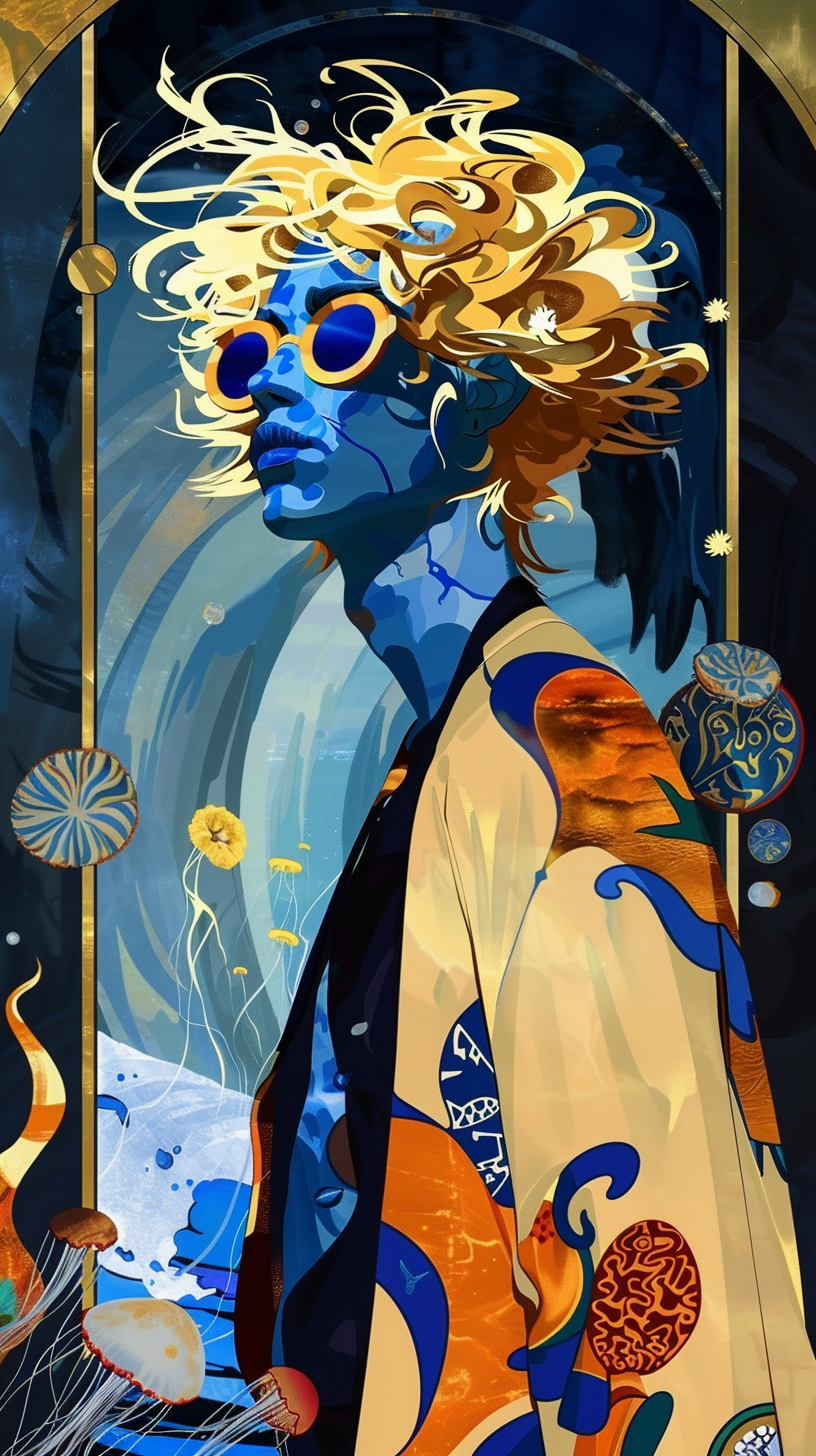
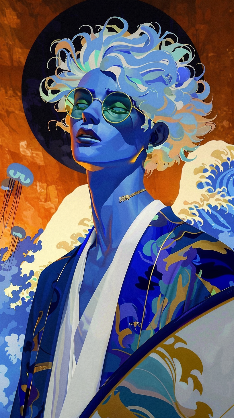
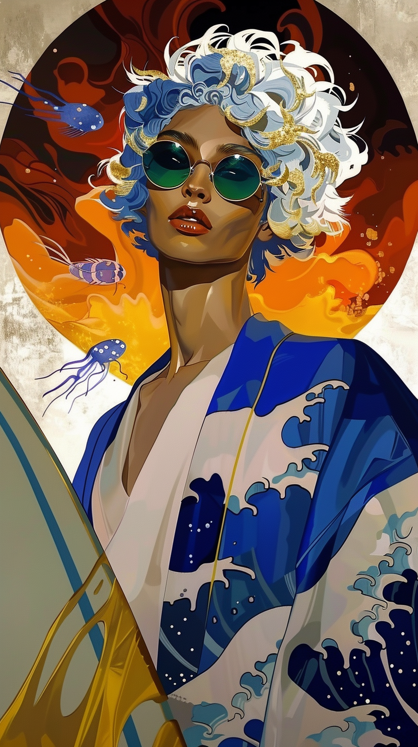
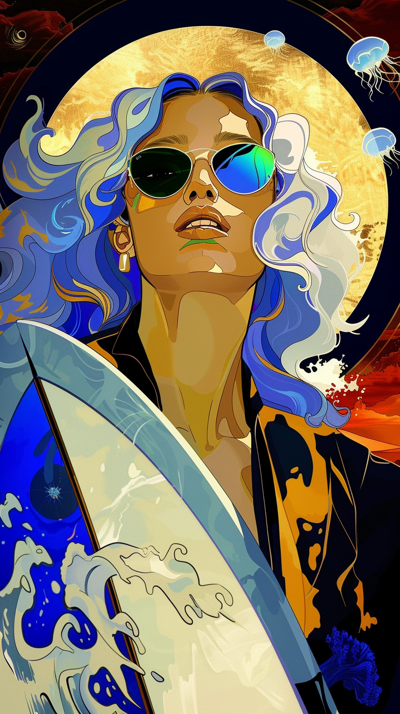
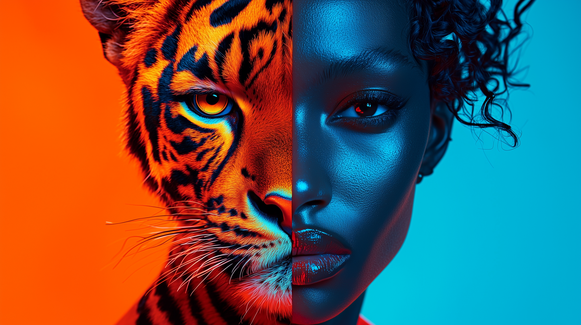
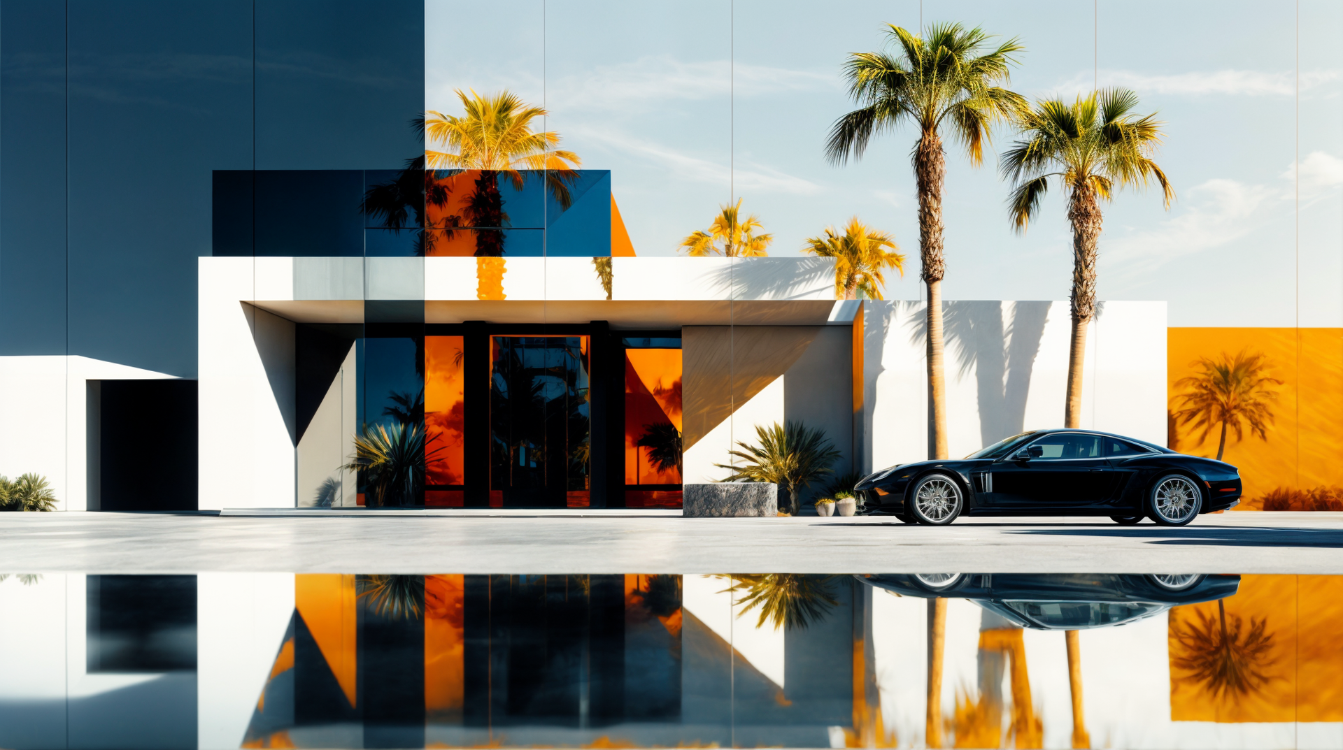
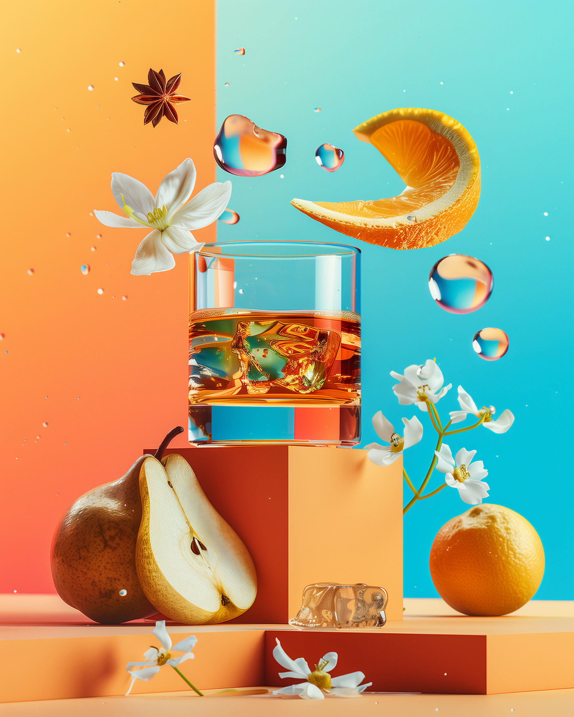
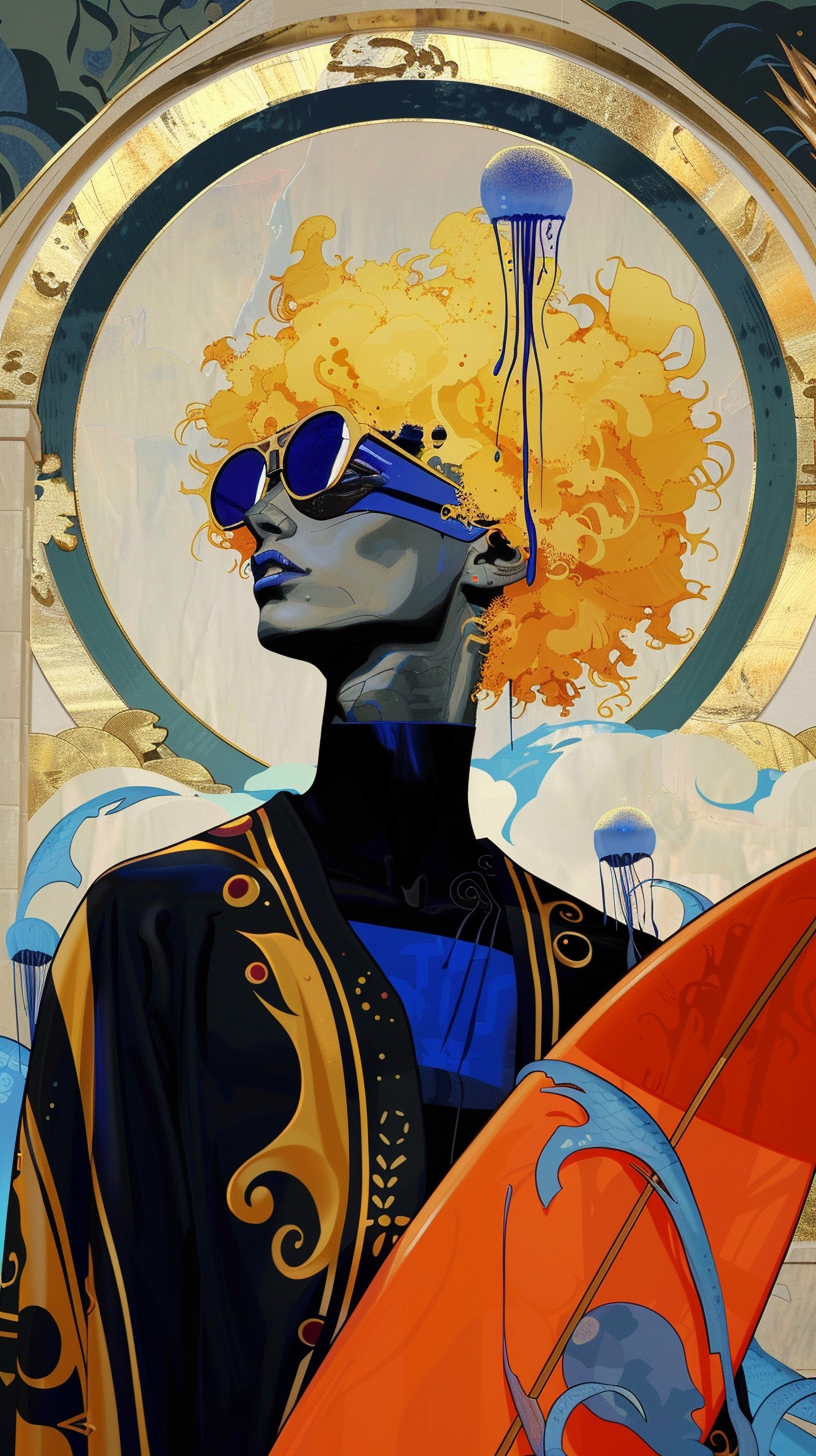
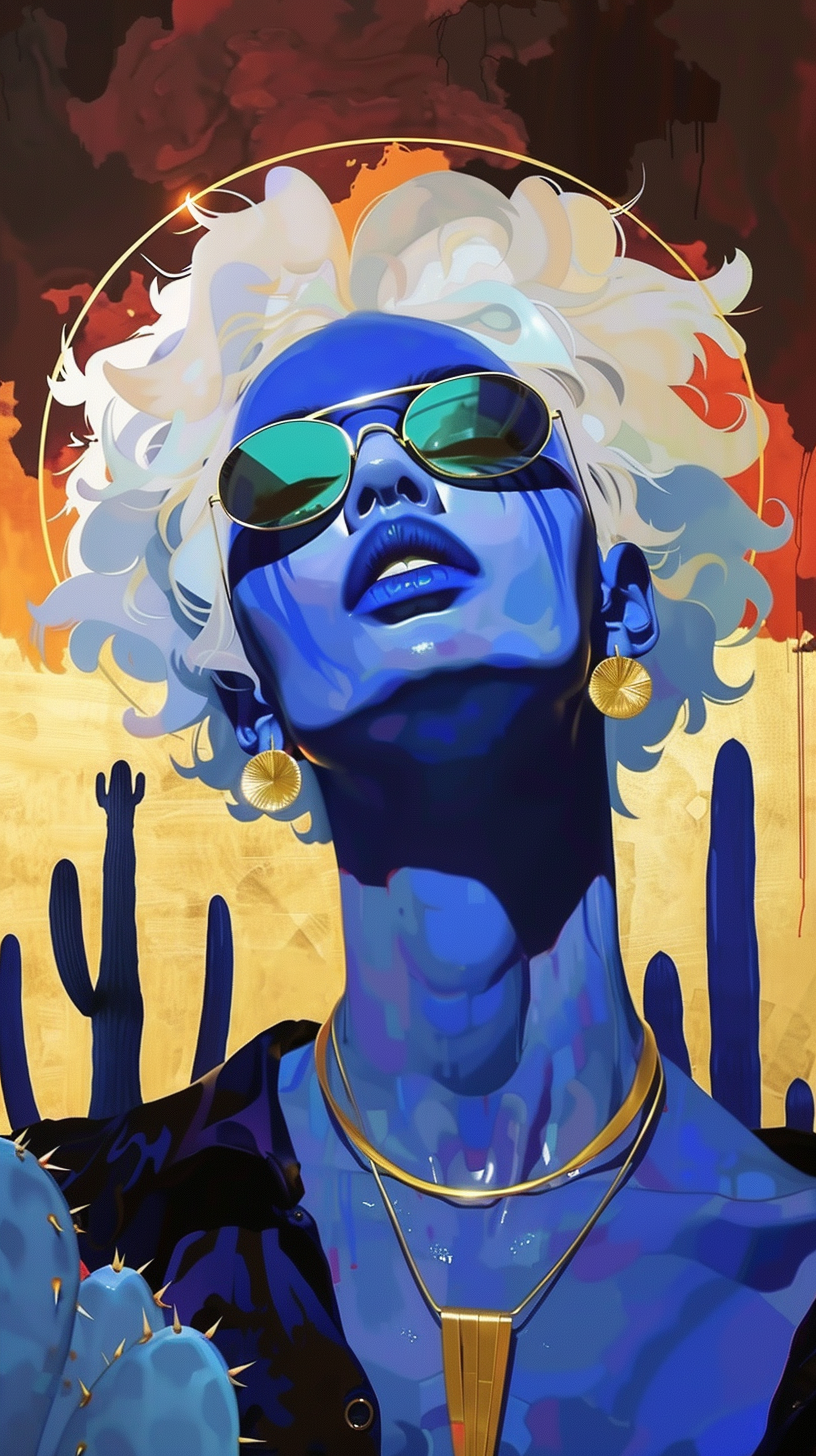
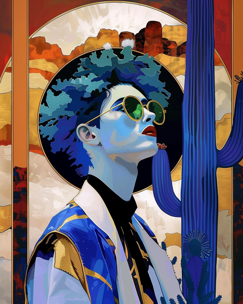
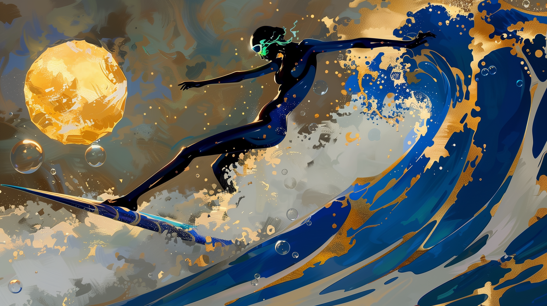
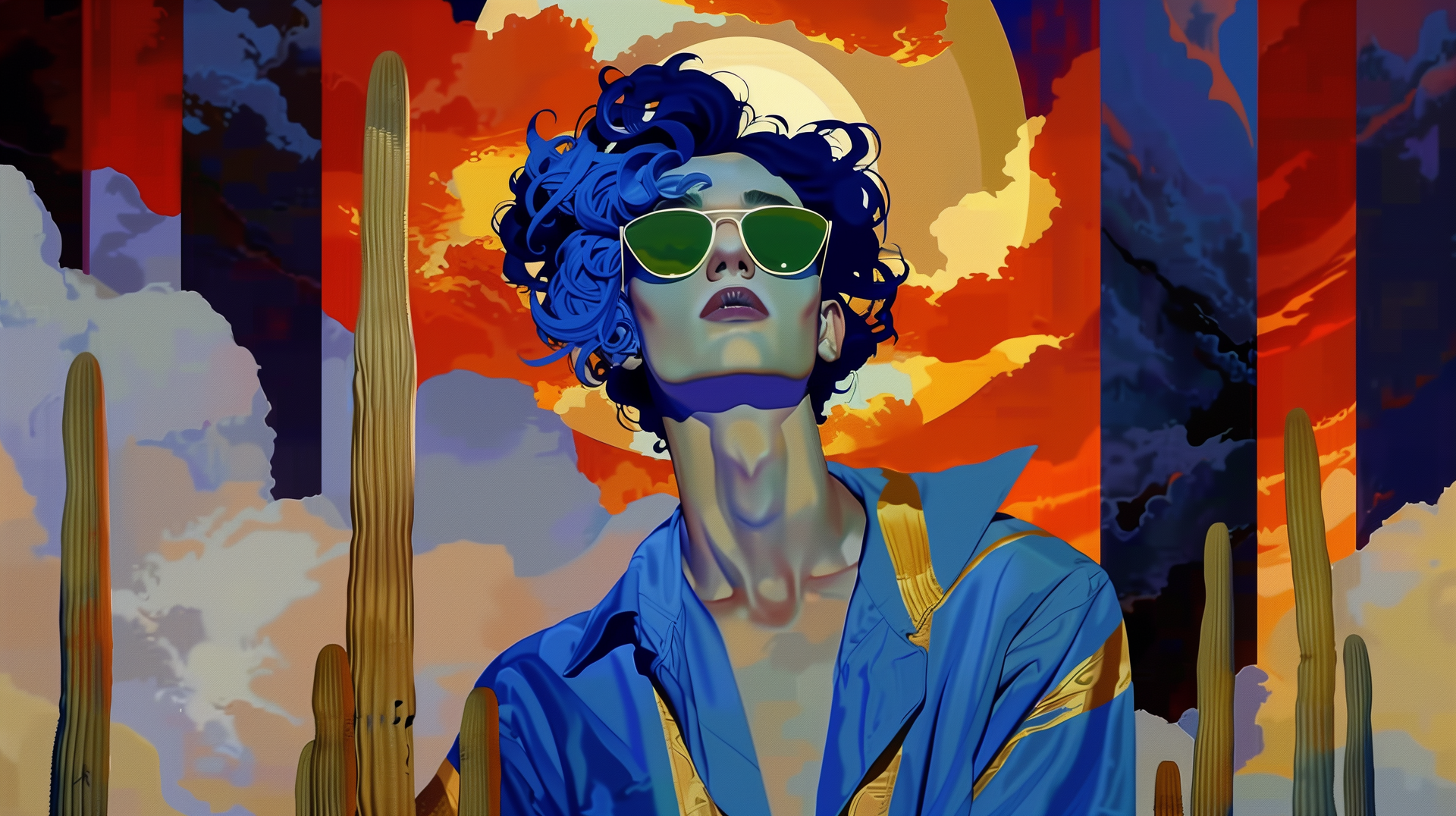
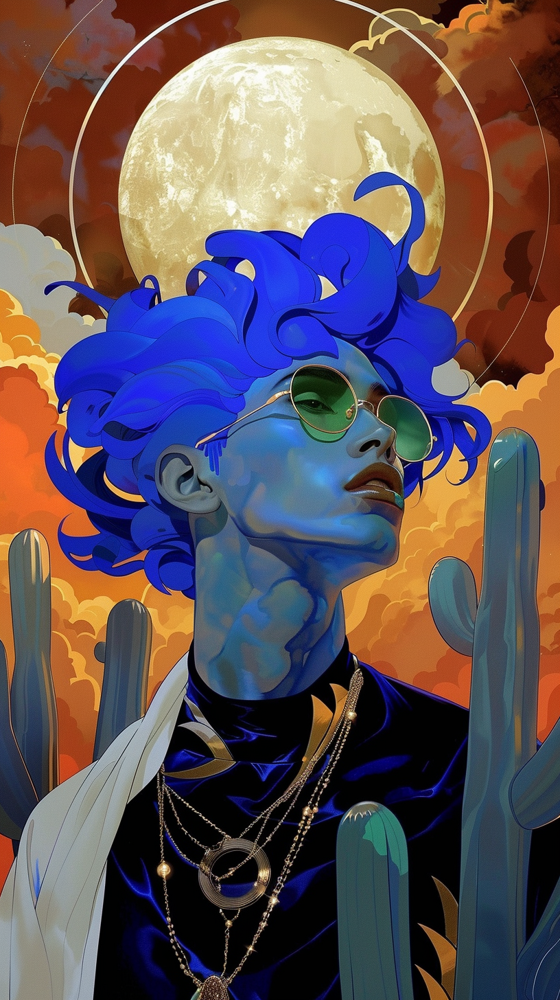
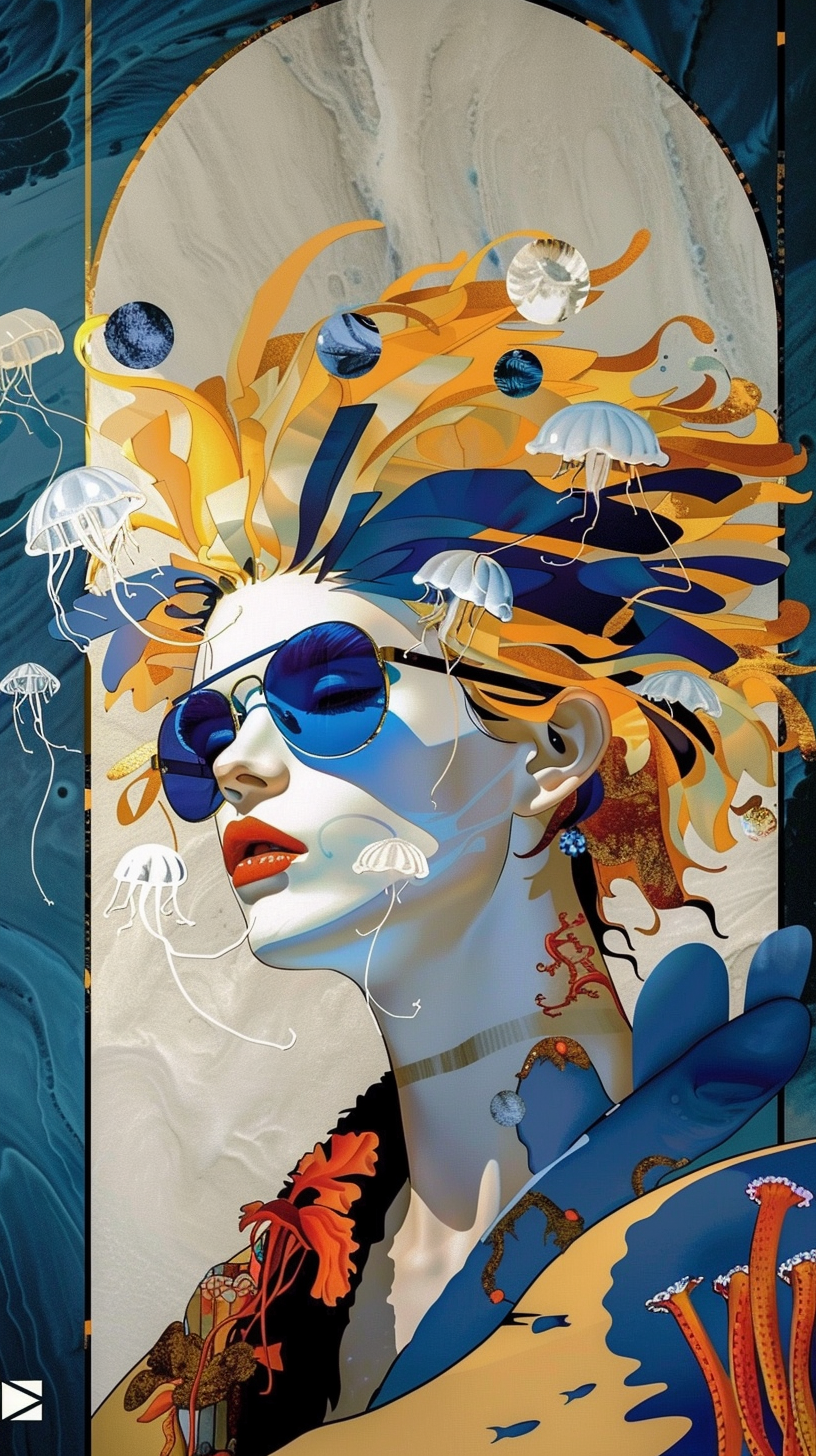
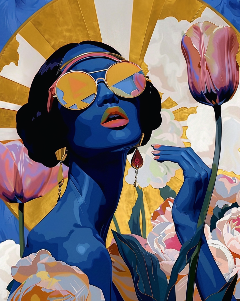
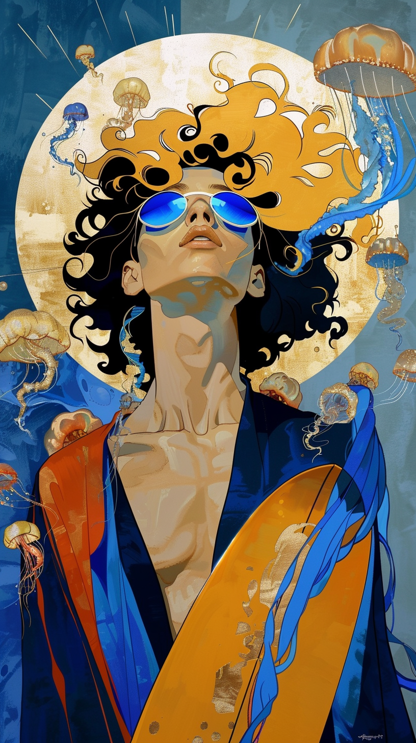
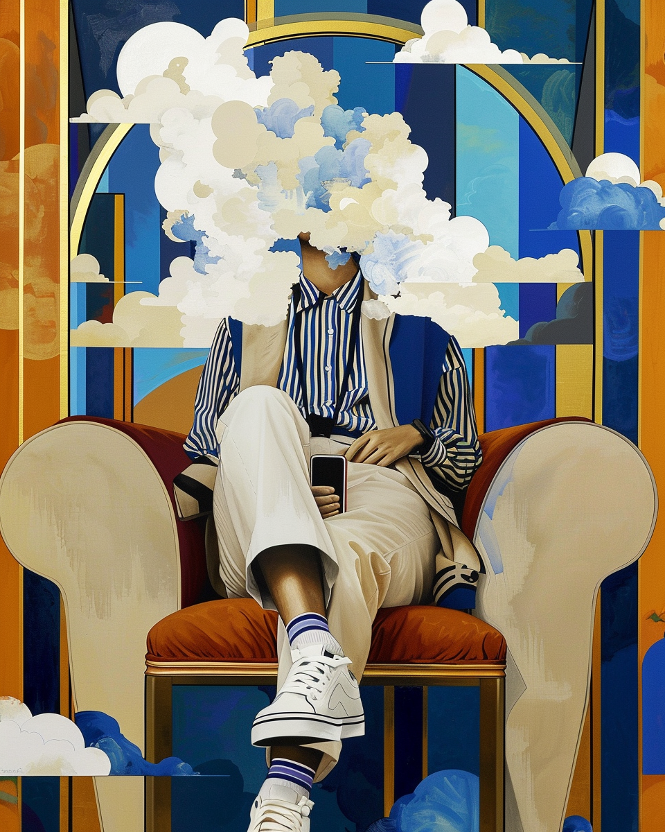
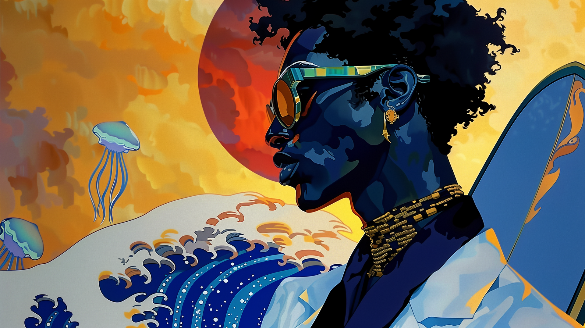
Drawing from these diverse influences, I developed a new artistic style that I call Chromafusion. This style is a blend of the vibrant, surreal elements of Nagel, Warhol, and Hokusai, infused with my own love of surfing, water, and bright, vibrant colors. Chromafusion is about creating art that is both visually striking and emotionally resonant, capturing the essence of my childhood memories and artistic inspirations.
- Patrick Nagel's Influence: Nagel's work is characterized by bold, flat colors and clean, minimalist lines. His stylized depictions of women exude a sense of glamour and sophistication. In Chromafusion, I incorporate Nagel's emphasis on color and minimalism, creating pieces that are visually bold yet elegantly simple.
- Andy Warhol's Pop Art: Warhol's vibrant use of color and his ability to transform everyday objects into iconic pieces of art have always inspired me. In Chromafusion, I draw on Warhol's pop art sensibilities, using bright, contrasting colors to create dynamic compositions that capture the viewer's attention.
- Katsushika Hokusai's Japanese Art: Hokusai's "The Great Wave off Kanagawa" is a masterpiece of color, form, and movement. Its powerful depiction of nature's force is both beautiful and awe-inspiring. In Chromafusion, I strive to incorporate the fluidity and energy of Hokusai's work, creating pieces that evoke a sense of movement and vitality.
The Elements of Chromafusion
- Vibrant Colors: Central to Chromafusion is a bold and diverse color palette. Each piece uses a spectrum of bright hues to create dynamic and engaging visuals.
- Surreal Imagery: Chromafusion artworks often include surreal elements, such as floating objects, abstract shapes, and unexpected combinations of figures and landscapes.
- Minimalist Design: Echoing Nagel’s style, Chromafusion employs clean lines and minimalist designs, allowing the colors and shapes to speak for themselves.
- Emotional Resonance: Each Chromafusion piece aims to evoke an emotional response, telling a story or conveying a feeling that resonates with the viewer.
Chromafusion is more than just a style; it’s a reflection of my artistic journey and the many influences that have shaped my work. From the early days of being captivated by Nagel’s painting to discovering the vibrant worlds of Warhol and Hokusai, each piece I create is a testament to the power of art to inspire and transform. I invite you to explore Chromafusion and join me on this colorful, surreal journey through creativity and imagination.